Dashboard Guide 1.3. Ticket Type YoY Analysis
 Updated
by Robyn Marais
Updated
by Robyn Marais
This dashboard provides a year-on-year comparative analysis of ticket sales and revenue performance by ticket type and category, helping users evaluate how the current event is tracking versus the previous event. It is designed to support clients in identifying ticket trends, optimizing inventory, and assessing growth areas across Ticket Types and Categories.
The dashboard focuses on like-for-like analysis across ticket quantities, revenues, and order statuses to highlight category performance and enable better forecasting and strategic planning.
This guide walks you through each key element of the dashboard to explain what the visuals represent and how to interpret the data effectively.
The dashboard enables you to:
- Compare current and past event performance across ticket types
- Measure YoY growth or decline in sales volume and revenue
- Identify which ticket tiers or offers are gaining traction (or underperforming)
- Make informed decisions about ticket type allocation and marketing focus
- Understand sales pacing ahead of your next event
Days to go
At the top of the dashboard, you'll find a “Days to Go” figure to help orient the timeline view.
To ensure a like-for-like comparison between current and past events (even if their dates differ), adjust the “Days Before Event” filter to: is between [inclusive] the current days before value and 360. This aligns data points based on how many days remain before the event date to standardise comparison across events.
Current Event, Change, Past Event
This section presents comparison tiles for key performance indicators (KPIs):
- Total Tickets Sold
- Gross Revenue
The visual tiles allow for a quick snapshot of current event performance against the equivalent time frame from the previous year to help you gauge if you’re ahead, behind, or on track.
Ticketing Categories YoY
This tabular view breaks down ticket sales by category (e.g., GA, VIP, VVIP) across the current and past events, including percentage change.
The purpose is to assess how each ticket category is performing compared to the previous year, helping you to optimise pricing and allocation.
Example insight: VIP tickets have seen the largest growth (+7%), highlighting increased demand for premium experiences. This could justify allocating more VIP inventory or enhancing premium offerings.
Ticket Category | Past Event | Current Event | % Change |
GA Tickets | 11,265 | 11,958 | +6% |
VIP Tickets | 1,983 | 2,130 | +7% |
Query Insight
This AI-generated narrative provides instant context based on the visualisations that follow, in this case the Category Sales YoY data.
- This offers a natural language summary of key trends.
- It eliminates the need for manual interpretation of graphs.
The purpose is to clearly communicate how ticket sales are trending over time relative to the same period last year.
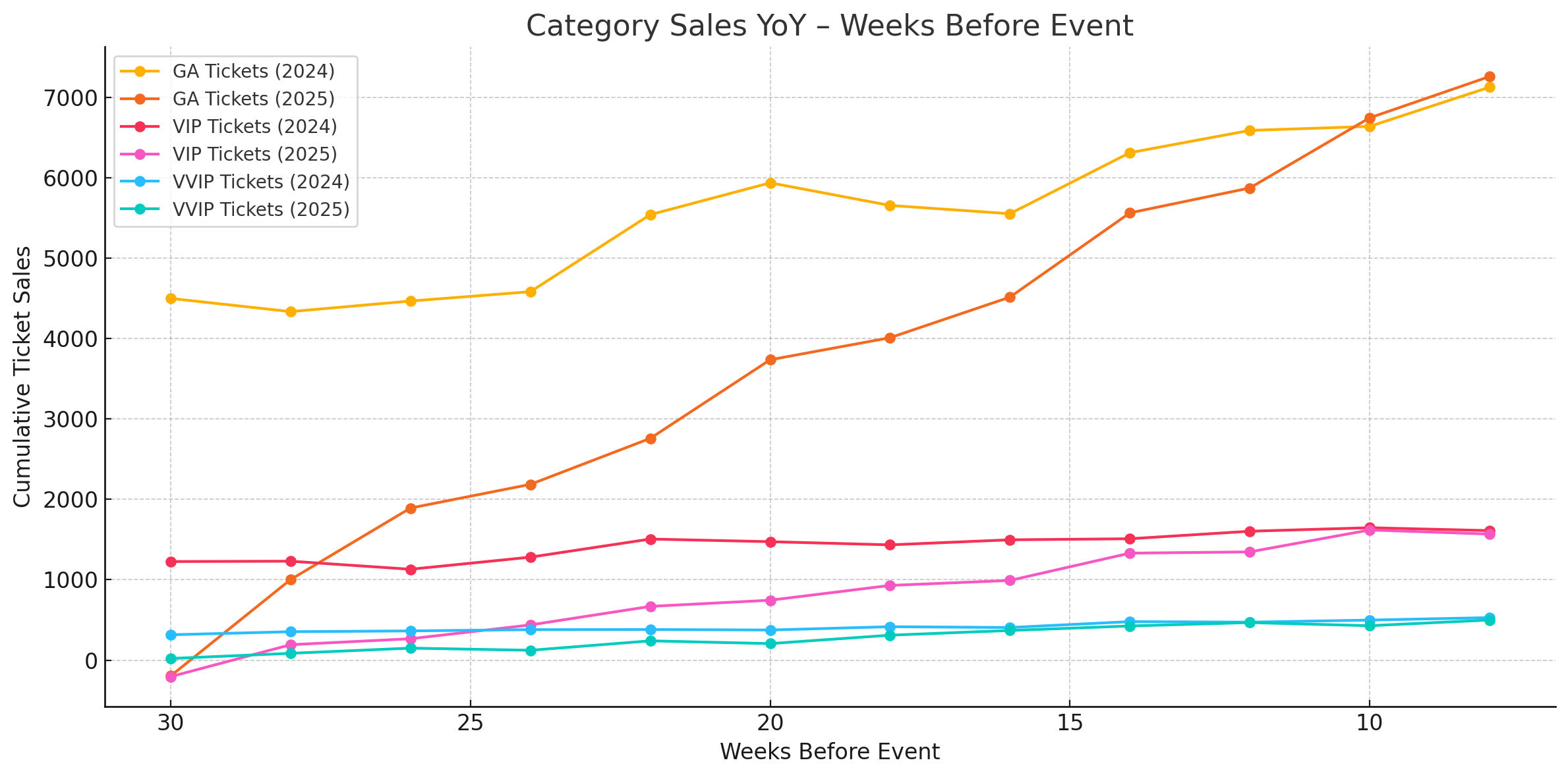
Category Sales YoY - Weeks Before Event
- A line graph tracking cumulative sales over time by ticket category (e.g., GA, VIP, VVIP, Merchandise)
- The x-axis shows weeks before the event, aligning both current and past events
How to use it:
- Compare sales momentum across years
- Identify when ticket sales start accelerating
- Gauge the effectiveness of timed campaigns (e.g., early bird launches, flash sales)
Query Insight
This AI-generated narrative provides instant context based on the visualisations that follow, in this case the Ticket Types YoY data.
- This offers a natural language summary of key trends.
- It eliminates the need for manual interpretation of graphs.
The purpose is to clearly communicate how ticket sales are trending over time relative to the same period last year.
Ticket Types YoY
Compares the number of tickets sold per ticket type in the current vs past event
Includes % Change to highlight growth or decline
How to use it:
- Identify top-performing ticket types
- Spot emerging trends (e.g., rising interest in bundle offers or premium tiers)
- See which ticket types may need pricing or promotional adjustments
Ticket Type | Tickets Sold Past Event | Ticket Sold Current Event | % Change |
General Access Early Bird | 1998 | 2987 | 49% |
General Access Late Bird | 3466 | 4567 | 32% |
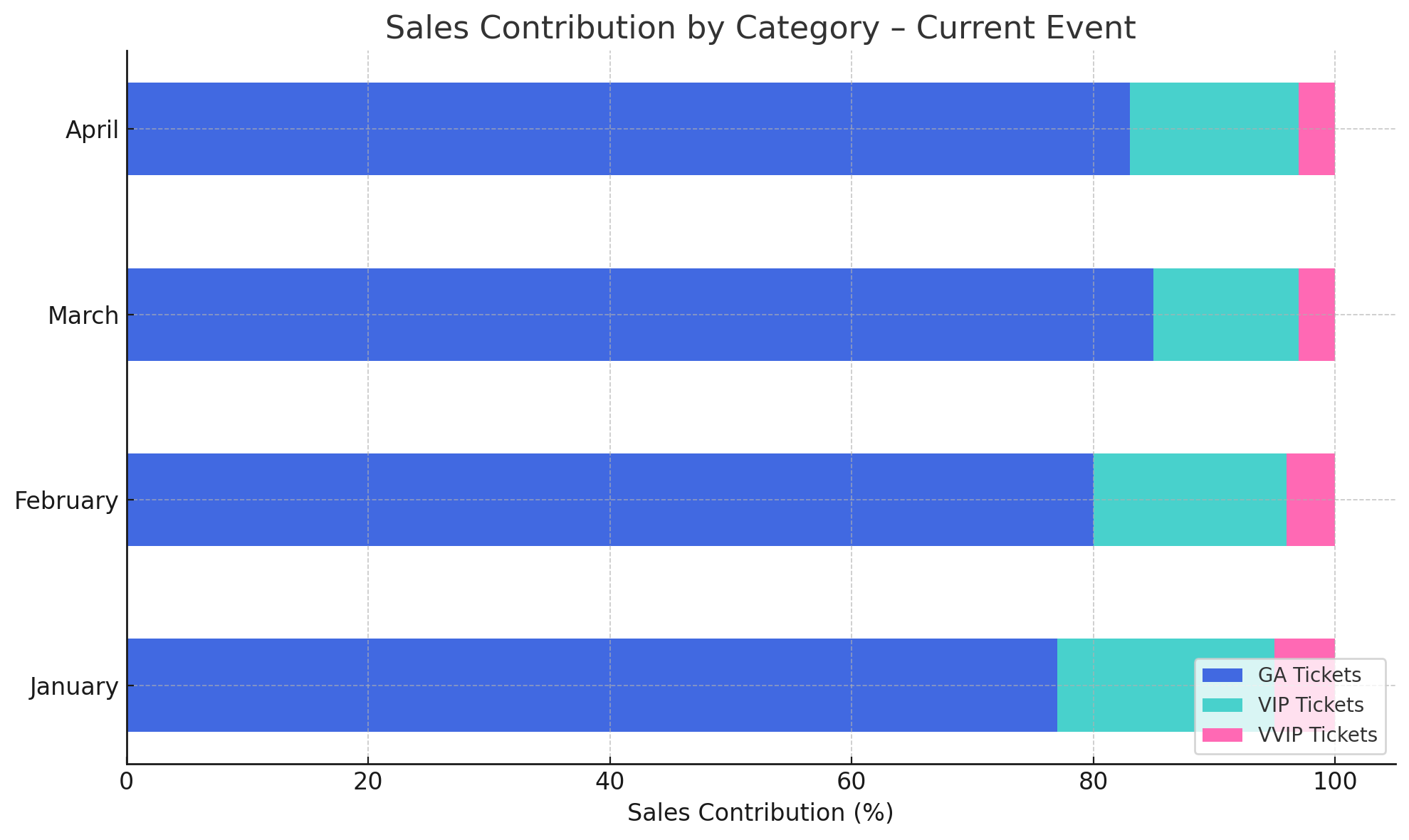
Sales Contribution by Category - Current Event
This horizontal stacked bar chart breaks down ticket sales for the current event by month and ticket category (e.g., GA, VIP, VVIP). It shows the percentage contribution of each category to total monthly sales.
How to use it:
- Spot which ticket types are dominating sales month-by-month
- Identify when VVIP or merchandise gains traction in the sales cycle
- Support decisions about where to focus future marketing based on seasonal trends
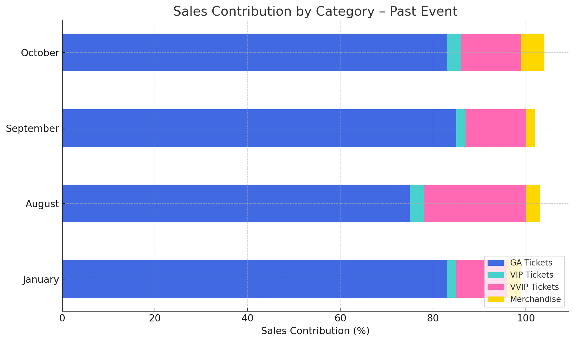
Sales Contribution by Category - Past Event
Similar to the current event view, this chart displays historical performance per ticket category across past months.
How to use it:
- Compare past buyer behavior to current patterns
- Spot any shift in category preference over time
- Use historical seasonality to better plan future campaigns or pricing changes
Ticket Types Detail
Adds breakdown by revenue, quantity, and remaining inventory
Provides detail for deeper analysis (e.g., how much stock is left)
How to use it:
- Identify top-performing ticket types
- Spot emerging trends (e.g., rising interest in bundle offers or premium tiers)
- See which ticket types may need pricing or promotional adjustments
Ticket Type | Revenue Past Event | Tickets Sold Past Event | Tickets Quantity Past Event | Tickets Remaining Past Event | Revenue Current Event | Tickets Sold Current Event | Tickets Quantity Current Event | Tickets Remaining Current Event |
VIP | 500000 | 500 | 600 | 100 | 400000 | 400 | 600 | 200 |
Layup Ticket Types by Status
This table breaks down ticket types and shows how many are currently in each purchase status:
- Placed – Tickets in active layup plans (payment not complete)
- Complete – Fully paid layup tickets
- Canceled – Layup plans that were cancelled
How to use it:
- Track the effectiveness of payment plan offerings
- See where buyers drop off (e.g., high cancellations for certain types)
- Spot strong performers where layup drives conversions
Ticket Type | Cancelled LayUp Tickets Past Event | Completed LayUp Tickets Past Event | Orders Placed LayUp Tickets Past Event | Cancelled LayUp Tickets Current Event | Completed LayUp Tickets Current Event | Orders Placed LayUp Tickets Current Event |
VIP | 500000 | 500 | 600 | 400000 | 400 | 600 |
🙋 FAQs
Q: Does this dashboard include complimentary tickets?
A: No – only paid tickets are included unless the filter is manually adjusted to include comps.
Q: Are refunds shown here?
A: Refunded tickets are typically excluded. This view reflects active, paid tickets only.
Q: Can I compare more than two events?
A: For best clarity, this dashboard is optimized for comparing two events. Ask your account manager about custom setups for multi-event trends.
Q: Can I use this to test dynamic pricing?
A: Yes – it's especially useful to review how price adjustments during sales periods have impacted purchase trends.