Attending An Event
Account Settings
Billing and Payment
Account Settings
Delete Your Account
Link Facebook or Google
ID or Passport Number Not Valid
Edit Details on Your Profile
Privacy and Security
Tickets
Cashless
Howler Active
Organising An Event
Getting Started
Video Tutorial - Getting Started
Organiser Approval Process
Getting Started with Howler
Our Services
Getting Paid
Howler Customer Support
Payment Gateway Options - For organisers
Manage your account
Setup your event
How to create an event
How to Make My Event Searchable on Howler.co.za
Event Look and Feel
Ticket Type Settings
How to enable donations for your event
Express Checkin
Enable Ticket Resale for your Event
Marketing Tools
Ticket Reps
How to drive ticket sales
Ticket Bundles and Specials
Issue Complimentary Tickets
Custom Ticket Type Links
Marketing Tools - Sending an email campaign
Marketing Tools - Sending an SMS campaign
Setting Up Google Analytics Tracking
Integrating the Facebook Pixel
Howler Brand/CI/Style Guide
Embedded links
Create a QR code linking to your ticketing page
Sponsor Assigning Complimentary Tickets
Event Customisation
Event Page Customisation within the organiser portal
Premium Event Customisation
How to Optimize an Image
Going Cashless
Going Cashless with Howler
Howler RFID Wristband Design Template
Vendor fees - For organisers
Cashless Sales Reports
How to drive Online Topups for a Cashless event.
Cashless Customer Journey
Ticket Scanning
Reporting
Event Protect
Howler Backend - Active Admin
Howler Backend Active Admin
Howler Backend Active Admin - Manage Organiser Roles
Howler Backend Active Admin - Reps
Howler Backend Active Admin - GTM configuration
Howler Backend Active Admin - Create Ticket Types
Howler Backend Active Admin - Promo Codes
Howler Backend Active Admin - Create a Pre Registration Event
Howler Backend Active Admin - Unique Registration
Howler Backend Active Admin - Data Capture
Streaming Online Events
How to create an Online Streaming Event
How to enable Express Check-in for your event
Finding your stream URL
How to schedule a Facebook Live video stream - Using your computer
How to start a Facebook Live video stream - Using your mobile device
How to setup a private Zoom web conference
Pulse
Dashboard Guide 1.1. Ticketing Overview YoY Analysis
Dashboard Guide 1.2. Daily Sales Dashboard
Dashboard Guide 1.3. Ticket Type YoY Analysis
Dashboard Guide 1.4. Price YoY Analysis
Dashboard Guide 1.5. Payment YoY Analysis
Dashboard Guide 4. Audience YoY Analysis
Dashboard Guide 5. Abandoned Cart
Dashboard Guide 6.1.1. Event Sales Overview
Dashboard Guide 6.1.3. Bar Sales
Dashboard Guide 6.1.5. Event Sales Demographics
Dashboard Guide 6.3.1. Total Topups Overview YoY Analysis
Dashboard Guide 6.3.4. Total Topup Ticket Type YoY Analysis
Dashboard Guide 6.3.5. Total Topup Demographic
Dashboard Guide 6.1.4. Vendor Sales
Dashboard Guide 6.2. Cashless Check-Ins Dashboard
Dashboard Guide 6.1.6 Event Sales Ticket Type Analysis
Dashboard Guide 6.3.3. Onsite Topups YoY Analysis
Dashboard Guide 6.3.2. Online Topups YoY Analysis
Vendor at an event
Setting Up Your Vendor Account
Setting Up For An Event
Setting Up Your Menu
Editing Vendor Bank Details
How to use the Howler Cashless Point of Sales Devices - Training Video
Vendor Fees
Vendor Settlement
The Vendor Agreement
Vendor Sales Reports
Legal
Partners Resources
- All Categories
- Organising An Event
- Pulse
- Dashboard Guide 6.3.1. Total Topups Overview YoY Analysis
Dashboard Guide 6.3.1. Total Topups Overview YoY Analysis
 Updated
by Robyn Marais
Updated
by Robyn Marais
This dashboard presents a comprehensive view of cashless topups at the event, broken down by channel (online vs onsite), user behavior, and ticket categories. It helps event teams monitor revenue, assess channel performance, and understand guest behavior across both pre-event and on-site topup activity.
This guide walks you through each key element of the dashboard to explain what the visuals represent and how to interpret the data effectively.
The dashboard enables you to:
- Track total topup revenue and the split between online and onsite topups
- Understand guest topup timing, volume, and behavior by ticket category
- Assess the performance of onsite topup stations
- Identify high-value guest segments based on topup amounts
- Use timing trends to prepare staffing, infrastructure, and campaigns
Key Metrics
Total Topups: The full monetary value of all topup transactions made during and leading up to the event, across both online and onsite channels.
Total Topups (Qty): The total number of individual topup transactions completed. This includes multiple transactions by the same user.
Average Online Topup: The average value of a single online topup transaction. This shows how much users typically load onto their account when topping up before the event.
Average Onsite Topup: The average value of a single onsite topup. This reflects how much is typically loaded by guests during the event.
Total Topups
These headline tiles provide total topup value (ZAR) across the event.
How to use it:
- Gauge total uptake of the cashless system.
- Understand overall event liquidity and cash flow behavior.
Total Topups Qty
These headline tiles provide the number of individual topup transactions completed across the event.
How to use it:
- Gauge total uptake of the cashless system.
- Use transaction count vs value to infer topup sizes or guest confidence.
Key Metrics
Count of Users With an Online Topup: How many unique users completed at least one online topup.
Avg Online Topup of Those Who've Topped up: Average value per user for online topups.
Count of Users with an Onsite Topup: How many unique users completed at least one onsite topup.
Avg Onsite Topup of Those Who've Topped up: Average value per user for onsite topups.
Total Topups by Category
A bar chart showing the total value of topups per ticket category (e.g., General, VIP, Staff, Guest).
How to interpret it:
- Helps determine which ticket groups are contributing the most to overall topups.
- Useful for targeting promotions or identifying high-value guests.
Average Topups Amount by Category
Displays the average topup amount per person within each ticket category.
How to interpret it:
- Reveals which categories have guests with the highest spending behavior.
- Helpful for customizing perks, pricing, or future loyalty offers.
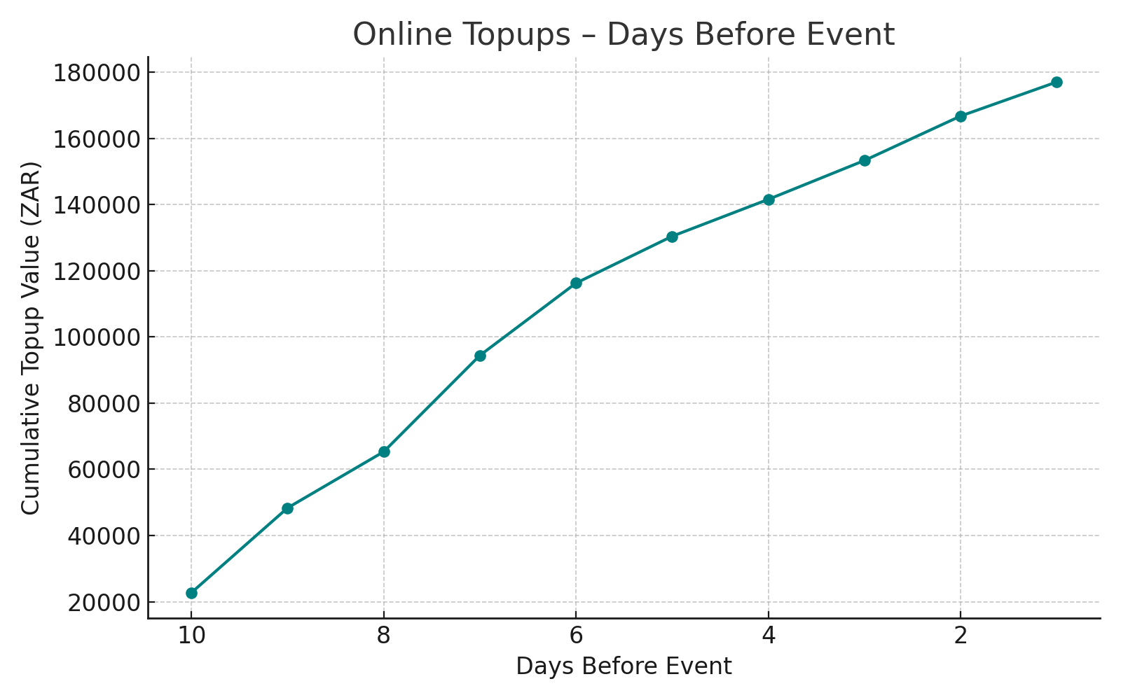
Online Topups Days Before Event
A line chart showing how topup activity accumulates in the days leading up to the event.
How to interpret it:
- Shows topup patterns to help plan campaign timing.
- Peak periods can be used to time reminder emails or digital nudges.
Days Taken From Ticket Purchase To Online Topup
A histogram showing how many days after buying a ticket guests topup their account.
How to interpret it:
- Reveals guest engagement lag.
- Can be used to define the best post-purchase window for outreach or upsell prompts.
Onsite Topup Trends
A time series chart tracking onsite topups over the event duration.
How to interpret it:
- Spot spikes in topup activity to better plan staffing, support, or logistics.
- Track performance across days and shifts.
Onsite Topup by Station & Payment Method
A bar chart comparing the total value of topups made at each physical topup station and by payment method.
How to interpret it:
- Helps monitor station performance.
- May indicate guest flow or bottlenecks at specific locations.
- Measures adoption of available payment options.
- Helps troubleshoot tech issues or allocate devices more effectively.
Average Onsite Topups By Station
Shows the average topup amount per transaction at each topup station.
How to interpret it:
- Reflects behavioral or demographic differences by location.
- High average values may suggest VIP stations or less frequent but larger transactions.