Dashboard Guide 1.4. Price YoY Analysis
 Updated
by Robyn Marais
Updated
by Robyn Marais
This dashboard provides a year-on-year comparative analysis of ticket pricing trends, including changes in average ticket price, price elasticity, and sales contribution by price point. It helps users assess how changes in pricing strategy have influenced buyer behavior across Ticket Types and Categories categories.
Designed to support pricing decisions, the dashboard offers visibility into the impact of pricing on demand, highlights average gross prices over time, and enables evaluation of price sensitivity per category. It is a key tool for revenue management, discounting strategies, and yield optimization.
This guide walks you through each key element of the dashboard to explain what the visuals represent and how to interpret the data effectively.
The dashboard enables you to:
- Track and compare average ticket prices between current and past events
- Analyze how price changes impact buyer behavior and ticket count
- Measure ticket sales contribution by price point to identify key price drivers
- Make data-driven decisions around tier pricing, promotions, and inventory strategy
Days to go
At the top of the dashboard, you'll find a “Days to Go” figure to help orient the timeline view.
To ensure a like-for-like comparison between current and past events (even if their dates differ), adjust the “Days Before Event” filter to: is between [inclusive] the current days before value and 360. This aligns data points based on how many days remain before the event date to standardise comparison across events.
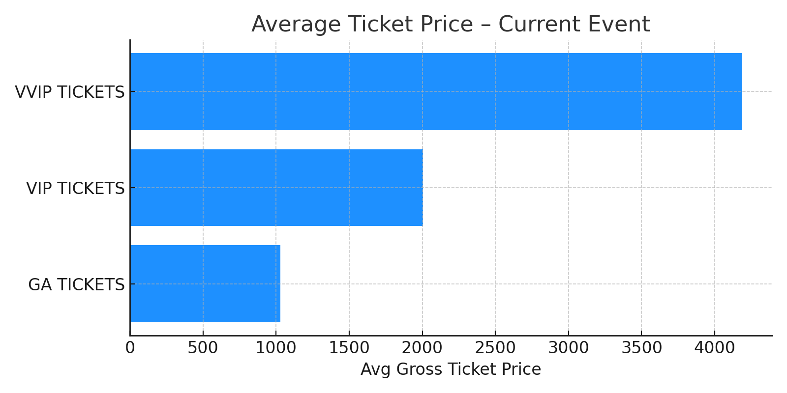
Average Ticket Price - Current Event
A horizontal bar chart displaying the average gross ticket price for each ticket category (e.g., GA, VIP, VVIP) for the current event.
How to use it:
- See at a glance how much attendees are paying, on average, across different tiers.
- Understand where your pricing sits today to evaluate margin or accessibility.
- Compare with historical averages to assess whether prices are trending higher or lower.
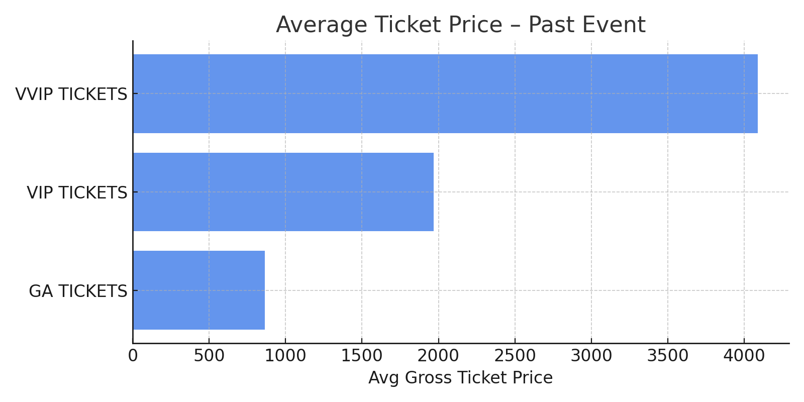
Average Ticket Price - Past Event
The same bar chart format as the current event, but for your previous event, allowing side-by-side analysis.
How to use it:
- Benchmark current ticket pricing against past levels.
- Assess whether increases or decreases have been implemented across tiers.
- Help explain variations in revenue or ticket count.
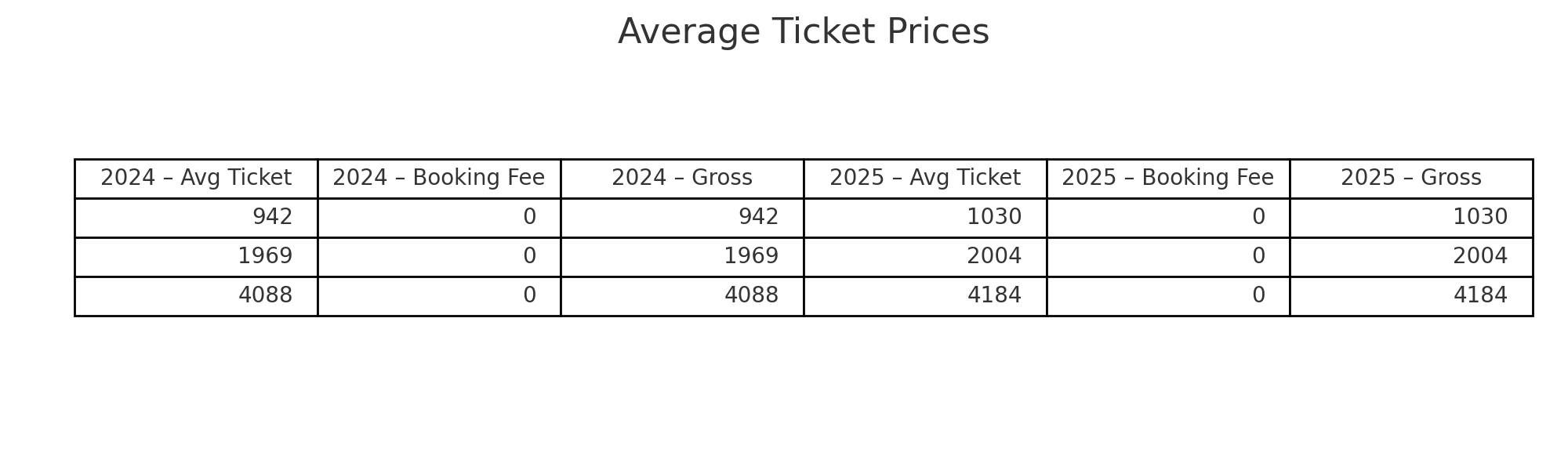
Average Ticket Prices
A detailed table comparing average ticket prices between the current and past events, broken down by:
- Avg Ticket – Net price of the ticket
- Avg Booking Fee – Additional fees included
- Avg Gross Ticket Price – Final price paid by the customer
How to use it:
- Understand the total cost to buyer across each category.
- Isolate the impact of booking fees on final pricing.
- Compare net vs. gross figures to align marketing or promotional communications.
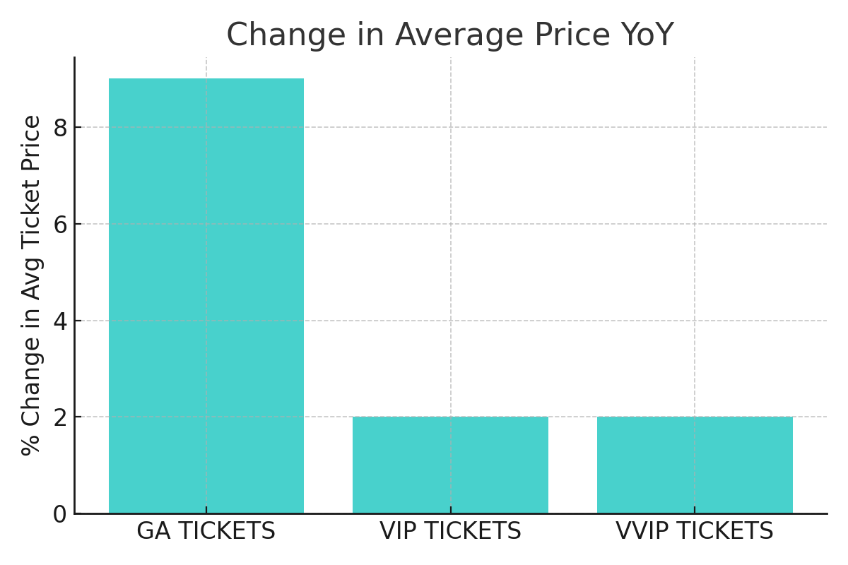
Change in Average Price YoY
A vertical bar chart showing the percentage change in average ticket price by category (e.g., GA, VIP, VVIP) from the past event to the current event.
How to use it:
- Quickly spot which categories have become more expensive—or more affordable.
- Use pricing changes to justify promotional strategies, VIP upgrades, or early bird offers.
- Pair with ticket count changes to assess price sensitivity and conversion rates.
Query Insight
This AI-generated narrative provides instant context based on the visualisations that follow, in this case the Average Ticket Price (incl. booking fees) YoY data.
- This offers a natural language summary of key trends.
- It eliminates the need for manual interpretation of graphs.
The purpose is to clearly communicate how ticket prices are trending over time relative to the same period last year.
Average Ticket Prices (incl. booking fees) YoY
A line graph tracking average ticket prices by category across days before the event.
How to use it:
- Compare current vs. past pricing levels over the lead-up period
- Understand when prices change and how frequently
Query Insight
This AI-generated narrative provides instant context based on the visualisations that follow, in this case the Ticket Price Elasticity YoY data.
- This offers a natural language summary of key trends.
- It eliminates the need for manual interpretation of graphs.
The purpose is to clearly communicate how ticket price elasticity is tracking over time relative to the same period last year.
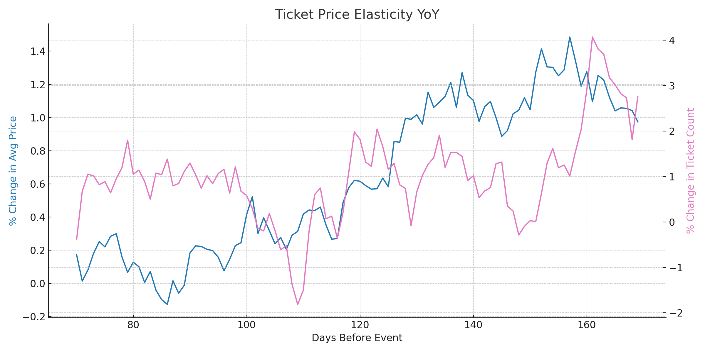
Ticket Prices Elasticity YoY
A dual-axis line chart illustrating the percentage change in average ticket price vs. the percentage change in ticket count over time for different ticket categories (GA, VIP, VVIP).
How to use it:
- Spot where price increases or decreases impacted ticket volume
- Identify elastic vs. inelastic pricing behaviors (e.g., high price change with stable sales suggests low elasticity)
- Align marketing campaigns or tier adjustments with demand sensitivity
Tickets Sales Contribution by Price - Current Event
A data table showing all ticket types and price points for the current event, along with:
- Total tickets sold
- Price point
- % Contribution to total sales
How to use it:
- Identify which price tiers are driving the most sales volume
- Evaluate performance of promotional tiers (e.g., “Black Friday”)
- Pinpoint underperforming tiers for potential removal or pricing adjustment
Tickets Sales Contribution by Price - Past Event
This table mirrors the previous one but displays data for your past event.
How to use it:
- Compare historical pricing tiers and volume to the current event
- Discover trends in buyer preferences or price tolerance over time
- Validate whether new price points introduced in the current event are effective
🙋 FAQs
Q: Does this dashboard include complimentary tickets?
A: No – only paid tickets are included unless the filter is manually adjusted to include comps.
Q: Are refunds shown here?
A: Refunded tickets are typically excluded. This view reflects active, paid tickets only.
Q: Can I compare more than two events?
A: For best clarity, this dashboard is optimized for comparing two events. Ask your account manager about custom setups for multi-event trends.