Attending An Event
Account Settings
Billing and Payment
Account Settings
Delete Your Account
Link Facebook or Google
ID or Passport Number Not Valid
Edit Details on Your Profile
Privacy and Security
Tickets
Cashless
Howler Active
Organising An Event
Getting Started
Video Tutorial - Getting Started
Organiser Approval Process
Getting Started with Howler
Our Services
Getting Paid
Howler Customer Support
Payment Gateway Options - For organisers
Manage your account
Setup your event
How to create an event
How to Make My Event Searchable on Howler.co.za
Event Look and Feel
Ticket Type Settings
How to enable donations for your event
Express Checkin
Enable Ticket Resale for your Event
Marketing Tools
Ticket Reps
How to drive ticket sales
Ticket Bundles and Specials
Issue Complimentary Tickets
Custom Ticket Type Links
Marketing Tools - Sending an email campaign
Marketing Tools - Sending an SMS campaign
Setting Up Google Analytics Tracking
Integrating the Facebook Pixel
Howler Brand/CI/Style Guide
Embedded links
Create a QR code linking to your ticketing page
Sponsor Assigning Complimentary Tickets
Event Customisation
Event Page Customisation within the organiser portal
Premium Event Customisation
How to Optimize an Image
Going Cashless
Going Cashless with Howler
Howler RFID Wristband Design Template
Vendor fees - For organisers
Cashless Sales Reports
How to drive Online Topups for a Cashless event.
Cashless Customer Journey
Ticket Scanning
Reporting
Event Protect
Howler Backend - Active Admin
Howler Backend Active Admin
Howler Backend Active Admin - Manage Organiser Roles
Howler Backend Active Admin - Reps
Howler Backend Active Admin - GTM configuration
Howler Backend Active Admin - Create Ticket Types
Howler Backend Active Admin - Promo Codes
Howler Backend Active Admin - Create a Pre Registration Event
Howler Backend Active Admin - Unique Registration
Howler Backend Active Admin - Data Capture
Streaming Online Events
How to create an Online Streaming Event
How to enable Express Check-in for your event
Finding your stream URL
How to schedule a Facebook Live video stream - Using your computer
How to start a Facebook Live video stream - Using your mobile device
How to setup a private Zoom web conference
Pulse
Dashboard Guide 1.1. Ticketing Overview YoY Analysis
Dashboard Guide 1.2. Daily Sales Dashboard
Dashboard Guide 1.3. Ticket Type YoY Analysis
Dashboard Guide 1.4. Price YoY Analysis
Dashboard Guide 1.5. Payment YoY Analysis
Dashboard Guide 4. Audience YoY Analysis
Dashboard Guide 5. Abandoned Cart
Dashboard Guide 6.1.1. Event Sales Overview
Dashboard Guide 6.1.3. Bar Sales
Dashboard Guide 6.1.5. Event Sales Demographics
Dashboard Guide 6.3.1. Total Topups Overview YoY Analysis
Dashboard Guide 6.3.4. Total Topup Ticket Type YoY Analysis
Dashboard Guide 6.3.5. Total Topup Demographic
Dashboard Guide 6.1.4. Vendor Sales
Dashboard Guide 6.2. Cashless Check-Ins Dashboard
Dashboard Guide 6.1.6 Event Sales Ticket Type Analysis
Dashboard Guide 6.3.3. Onsite Topups YoY Analysis
Dashboard Guide 6.3.2. Online Topups YoY Analysis
Vendor at an event
Setting Up Your Vendor Account
Setting Up For An Event
Setting Up Your Menu
Editing Vendor Bank Details
How to use the Howler Cashless Point of Sales Devices - Training Video
Vendor Fees
Vendor Settlement
The Vendor Agreement
Vendor Sales Reports
Legal
Partners Resources
- All Categories
- Organising An Event
- Pulse
- Dashboard Guide 6.1.4. Vendor Sales
Dashboard Guide 6.1.4. Vendor Sales
 Updated
by Robyn Marais
Updated
by Robyn Marais
This dashboard provides a detailed analysis of vendor sales performance during the event, breaking down sales data by ticket type, station, product, and transaction behavior. It is designed to help clients evaluate product performance, identify high-yield sales points, and understand purchasing behavior across different customer segments.
The dashboard presents insights into key metrics such as total vendor sales, number of vendor transactions, average spend per attendee, and orders per person. It includes granular breakdowns of sales by vendor station and product, as well as average transaction values, making it a valuable tool for optimizing product offerings, pricing strategies, and on-site operations.
This guide walks you through each key element of the dashboard to explain what the visuals represent and how to interpret the data effectively.
The dashboard enables you to:
- Track total vendor sales revenue and transaction volume.
- Identify top-performing vendors and products by sales value.
- Monitor purchasing patterns by ticket category and ticket type.
- Understand sales distribution across stations and peak selling times.
- Assess average transaction values to optimise pricing and bundles.
- Inform staffing, stock planning, and vendor placement strategies.
- Tailor future vendor selections and marketing based on customer spend behavior.
Key Metrics
Total Vendor Sales: Total revenue generated from all purchases made at vendor stalls during the event.
Total Vendor Transactions: Total number of individual sales transactions completed with vendors.
Average Spend per Attendee: Vendor: Average amount each attendee spent at vendor stalls.
Average Order per Person: Average number of transactions each attendee completed with vendors.
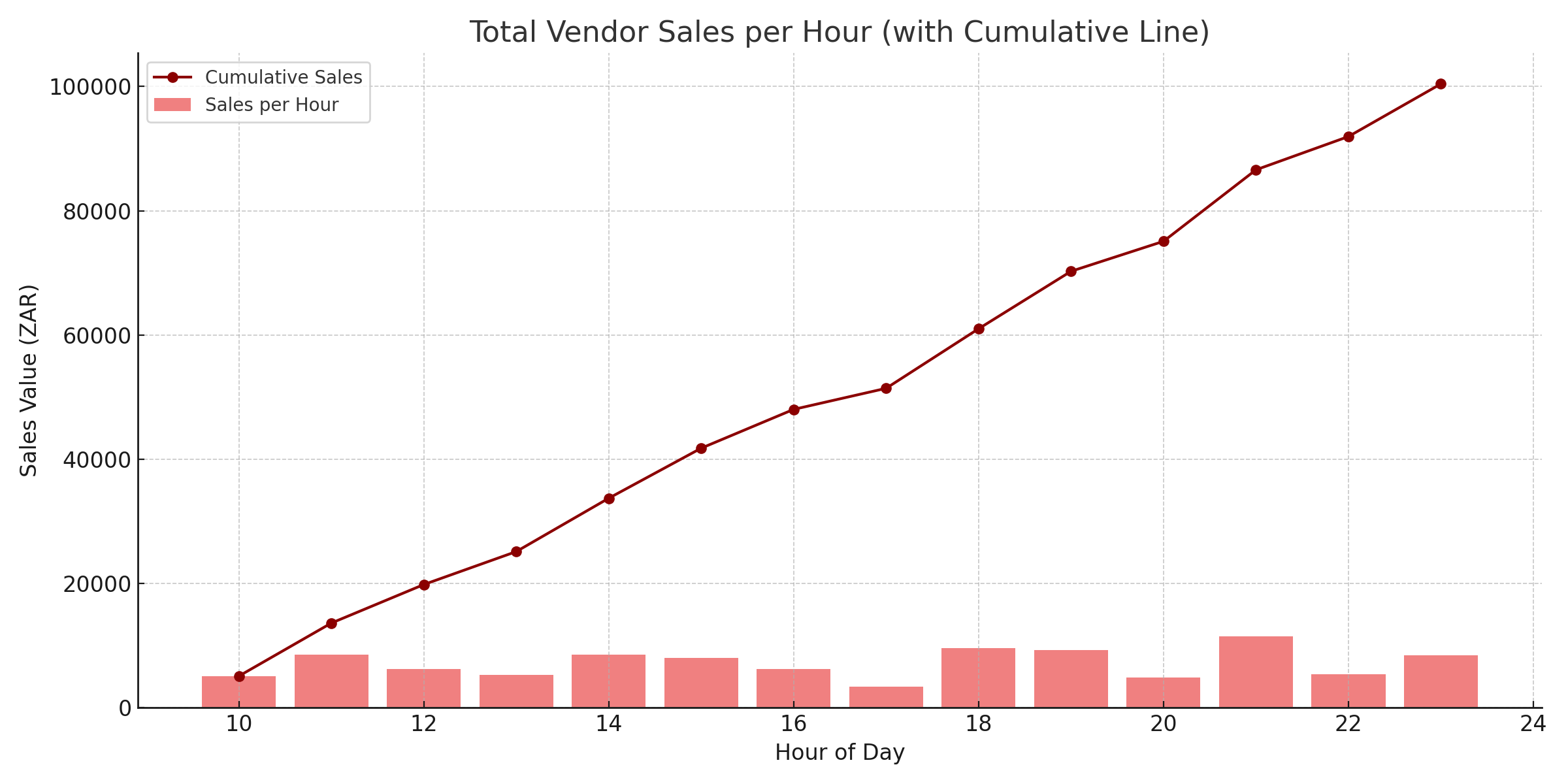
Total Vendor Sales per Hour
A bar graph representing hourly sales, overlaid with a line chart showing cumulative vendor sales over time.
How to use it:
- Identify peak times for food and merchandise sales.
- Inform optimal staffing and stock replenishment planning.
- Assess pacing and momentum of on-site spend throughout the event.
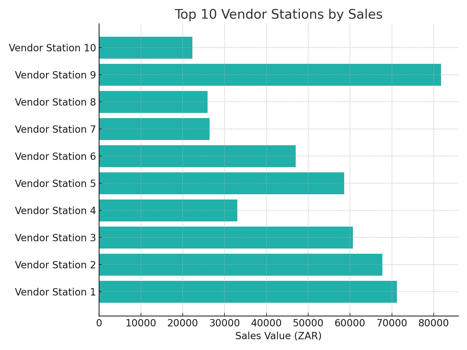
Top 10 Vendor Stations
A horizontal bar chart displaying the top 10 vendor stations ranked by total sales value.
How to use it:
- Recognise high-performing vendors.
- Prioritise partnerships or expand presence for top performers.
- Identify underperforming vendors needing support or review.
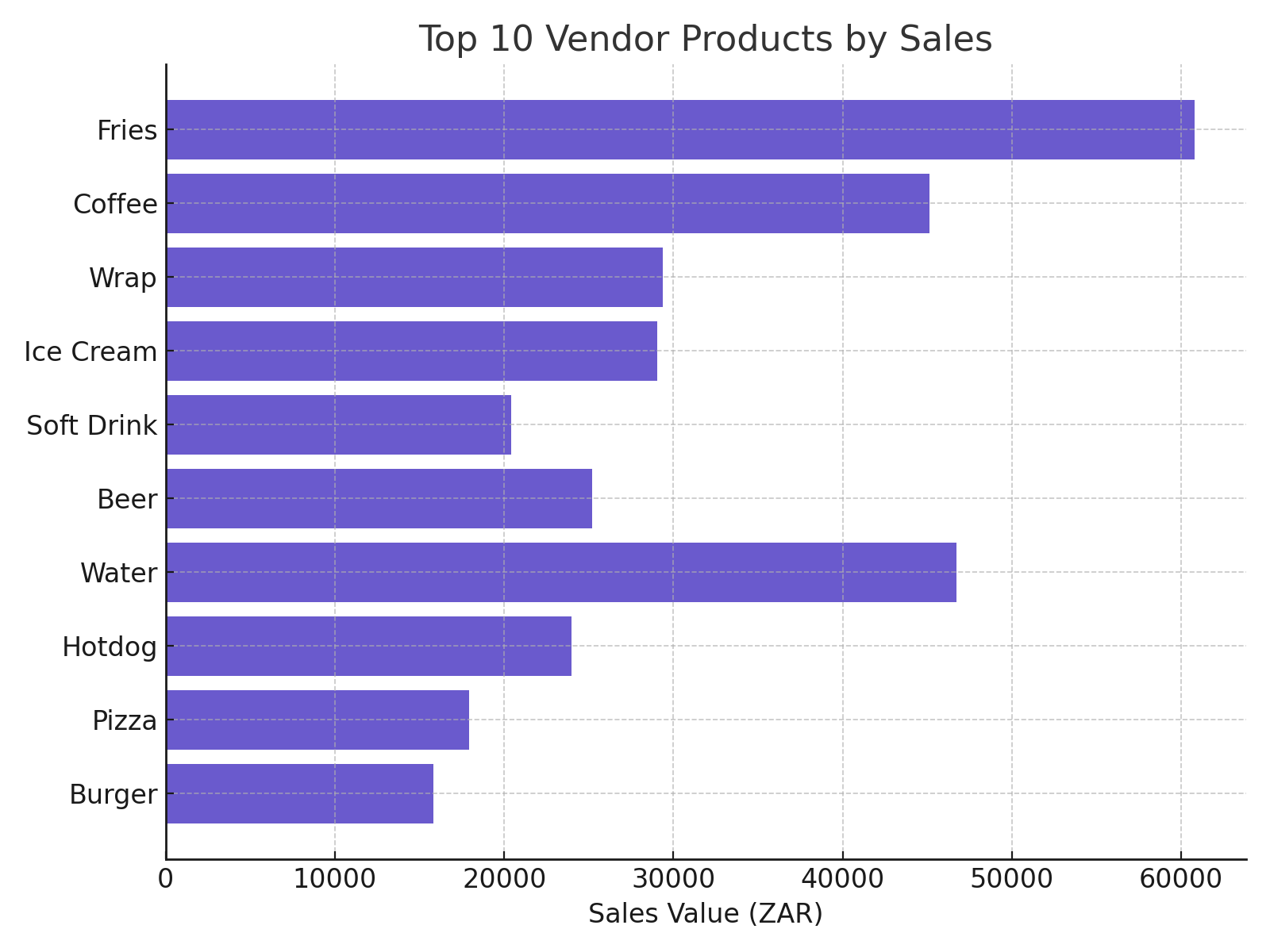
Top 10 Vendor Products
A horizontal bar chart displaying the top 10 vendor products ranked by total sales value.
How to use it:
- Identify the highest-demand products.
- Optimise stock procurement and inventory management.
- Plan future promotions around popular products.
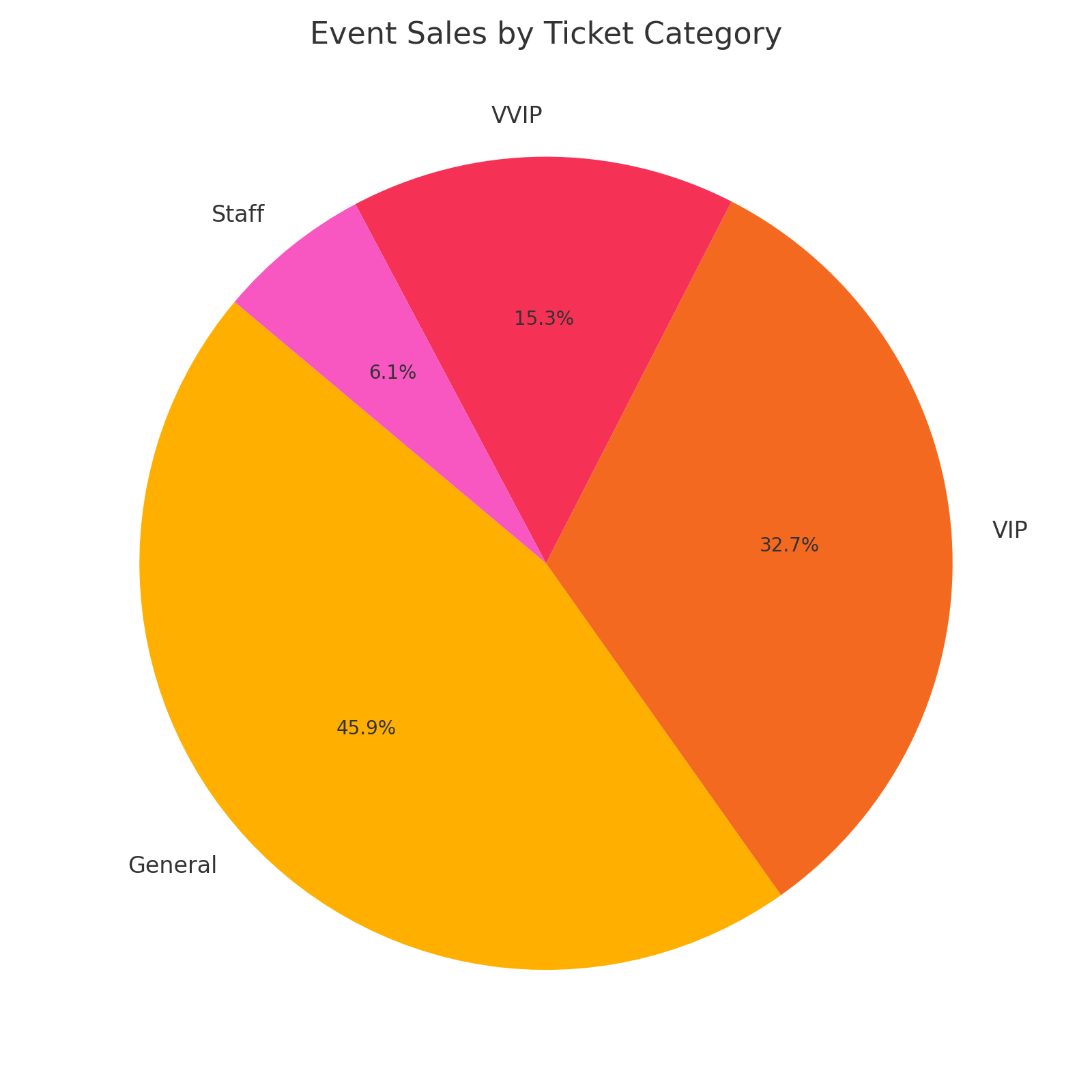
Event Sales by Ticket Category
A pie chart showing the proportion of vendor sales contributed by each ticket category (e.g., GA, VIP, Staff).
How to use it:
- Understand which attendee groups spend the most at vendors.
- Target promotions and vendor placement around high-value demographics.
Average Sales Value per Hour
A line chart showing how the average transaction value changed across hours during the event.
How to use it:
- Spot patterns in customer spending behavior.
- Identify when larger purchases are happening (e.g., mealtimes, happy hour).
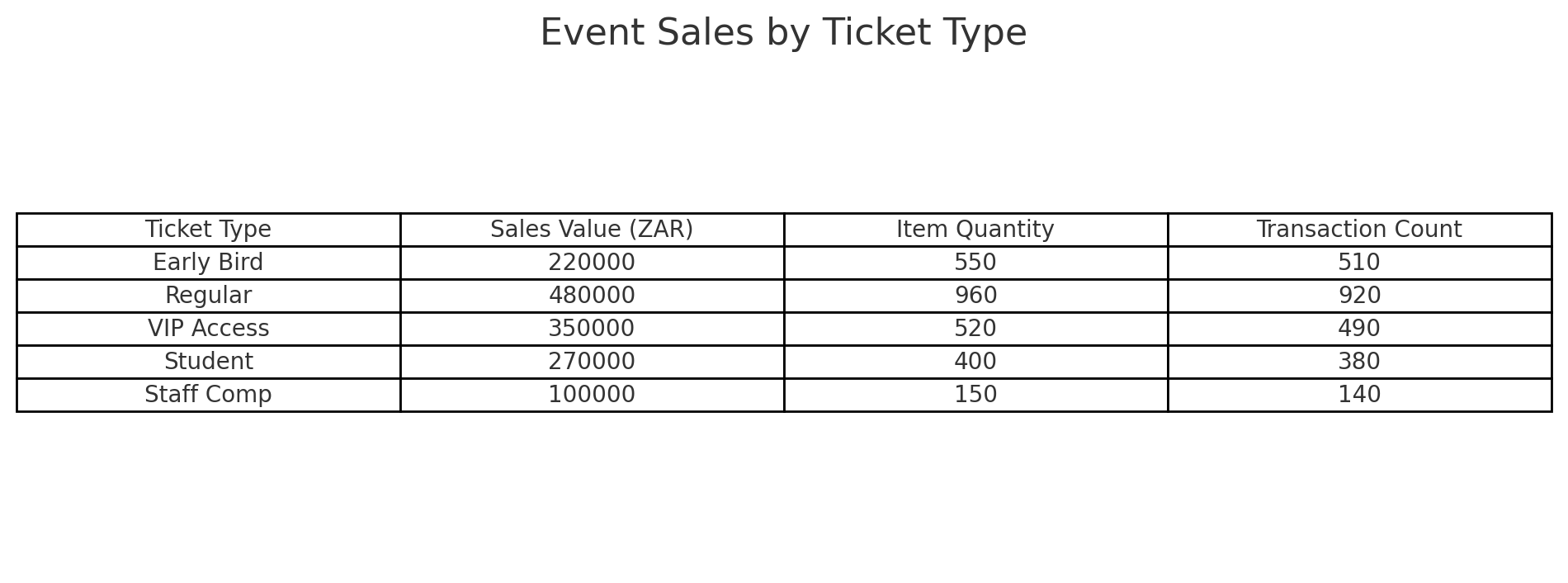
Event Sales by Ticket Type
A table listing ticket types alongside their corresponding:
- Total sales value
- Item quantities
- Transaction counts
- Average transaction value
- Spend per attendee
How to use it:
- Drill down into the performance of each ticket type.
- Analyse pricing tiers against sales behavior.
- Inform future ticket packaging and tiering strategies.
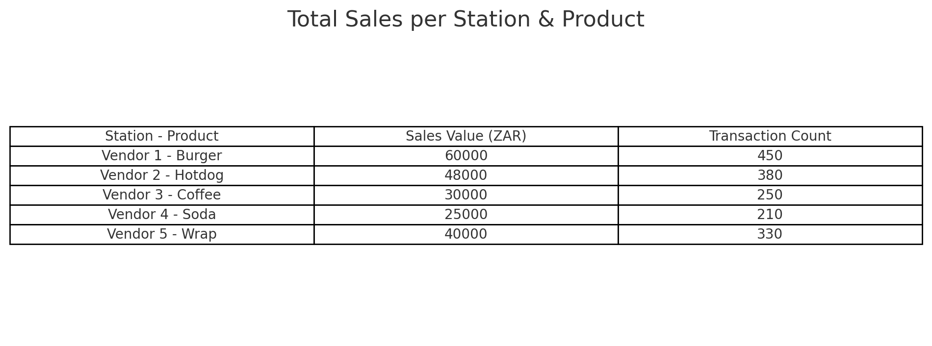
Total Sales per Station & Product
A table combining vendor station and product data, showing:
- Sale amount
- Item quantity
- Transaction count
- Average transaction value
How to use it:
- Identify which product-station combinations are most successful.
- Optimise inventory and placement for future events.
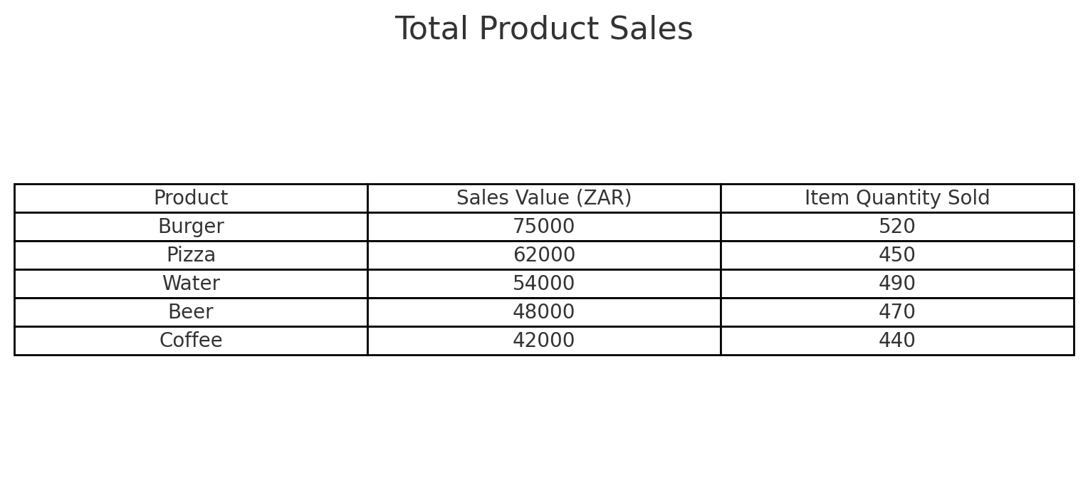
Total Product Sales
A table listing all products sold, ranked by:
- Total sale amount
- Item quantity sold
How to use it:
- Understand product-specific demand.
- Streamline menu offerings to focus on bestsellers.