Dashboard Guide 6.3.4. Total Topup Ticket Type YoY Analysis
 Updated
by Robyn Marais
Updated
by Robyn Marais
This dashboard provides a comprehensive breakdown of topup behavior segmented by ticket type and category. It offers visibility into total customer value by combining topups and ticketing spend, allowing clients to assess which ticket types drive the highest overall value. This is especially useful for strategic pricing, audience targeting, and topup campaign optimization.
The dashboard highlights online vs. onsite topup contributions, average topups across categories, and purchase timing patterns. It helps reveal customer spending behavior over time, giving insight into when value is captured in the purchase funnel (e.g., pre-event vs. onsite).
This guide walks you through each key element of the dashboard to explain what the visuals represent and how to interpret the data effectively.
The dashboard enables you to:
- Understand which ticket holders topup the most and how their spend varies by ticket category and type.
- Identify whether attendees are topping up more before or during the event to inform future communication strategies.
- Analyze how early vs. late buyers behave in terms of topup value and total customer spend.
- Combine ticket and topup spend to determine which attendee groups contribute the most revenue.
- Use average spend metrics to target high-spending customer segments for VIP services or incentives.
- Gain insights into which stations are most used or drive higher transaction values to guide physical layout planning.
- Monitor usage of different payment methods (e.g., card, cash, app) and refine the payment infrastructure accordingly.
- Use ticket category insights to create pricing, packaging, and promotional strategies that align with consumer spend behavior.
Key Metrics
Total Topups: The full monetary value of all topup transactions made during and leading up to the event, across both online and onsite channels.
Total Topups (Qty): The total number of individual topup transactions completed. This includes multiple transactions by the same user.
Total Online Topups: The full monetary value of all online topup transactions made leading up to and during the event.
Total Onsite Topups: The full monetary value of all onsite topup transactions made during the event.
Average Online Topup: The average value of a single online topup transaction. This shows how much users typically load onto their account when topping up before the event.
Average Onsite Topup: The average value of a single onsite topup. This reflects how much is typically loaded by guests during the event.
Online Topups By Category
A pie chart showing the % of total topups per ticket category (e.g., General, VIP, Staff, Guest).
How to interpret it:
- Helps determine which ticket groups are contributing the most to overall topups.
- Useful for targeting promotions or identifying high-value guests.

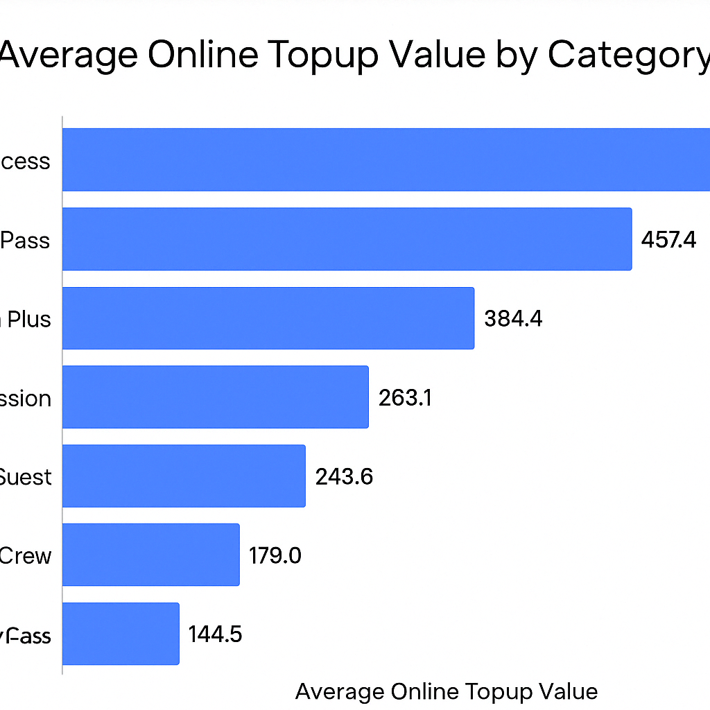
Average Online Topup Value by Category
This horizontal bar chart shows the average value of topups made online across different ticket categories.
- Each bar represents a ticket category (e.g., General, VIP, Crew).
- The length of the bar indicates the average topup amount per person in that category.
- Helps organisers understand which segments are topping up the most in advance, which can signal trust in the system, higher engagement, or spend potential.
- Useful for measuring the success of pre-event communications or incentives tied to online topups.
- Supports planning for on-site resource allocation (e.g., lower on-site demand from categories that topup online heavily).
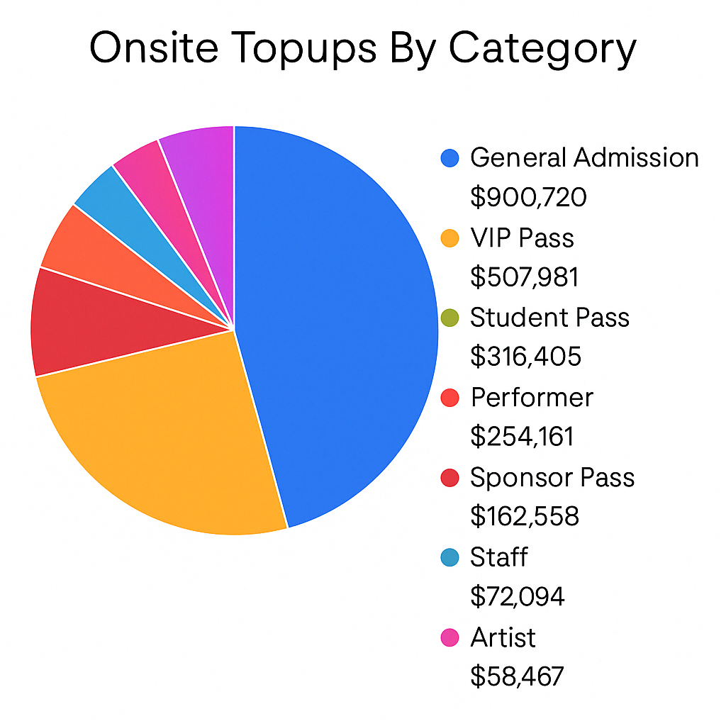
Onsite Topups By Category
This visual reflects the distribution of on-site topup values by ticket category. It gives a percentage breakdown of total on-site topup activity.
How to use it:
- See which ticket holders are relying more on on-site topups.
- Assess effectiveness of pre-event topup campaigns.
- Inform on-site operational planning (e.g. station demand).
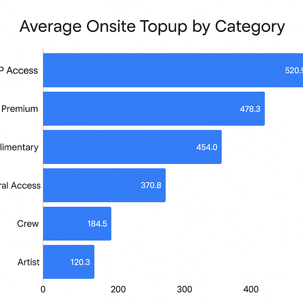
Average Onsite Topup by Category
This horizontal bar chart displays the average amount topped up on-site for each ticket category.
How to use it:
- Compare on-site spending habits across categories.
- Identify where additional marketing or signage may be needed to increase topup engagement.
- Understand behavioral differences between standard and premium attendees.
Query Insight
This AI-generated narrative provides instant context based on the visualisations that follow, in this case the Total Topups Contribution by Ticket Purchase Date data.
- This offers a natural language summary of key trends.
- It eliminates the need for manual interpretation of graphs.
The purpose is to clearly communicate how ticket purchase date contributes to total topups.
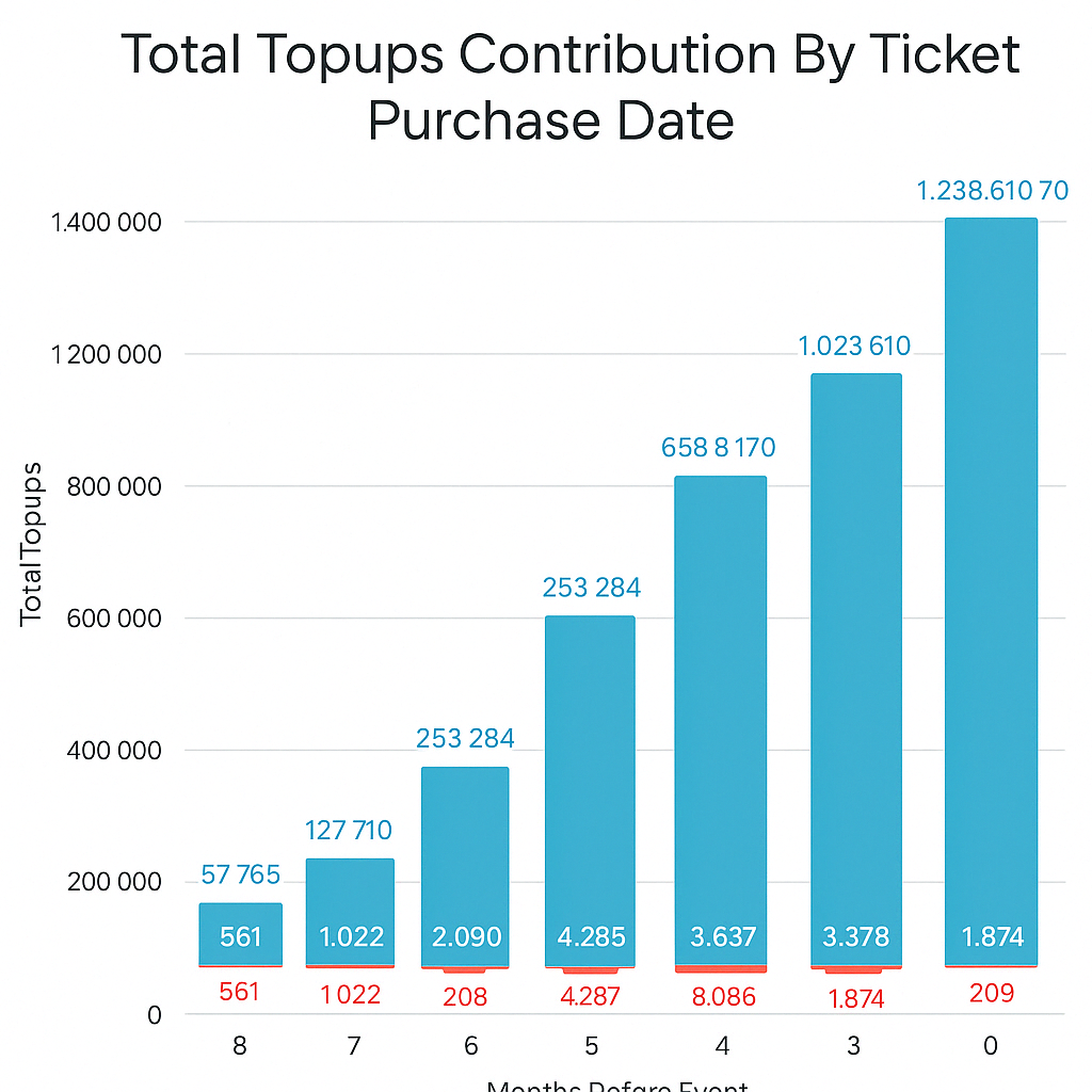
Total Topups Contribution By Ticket Purchase Date
This chart illustrates when customers who topup made their original ticket purchase, showing the correlation between ticket buying time and topup contribution.
How to use it:
- Understand long-term customer behavior (early vs late buyers).
- Identify ideal windows for upselling topups.
- Evaluate the impact of early commitment on spending.
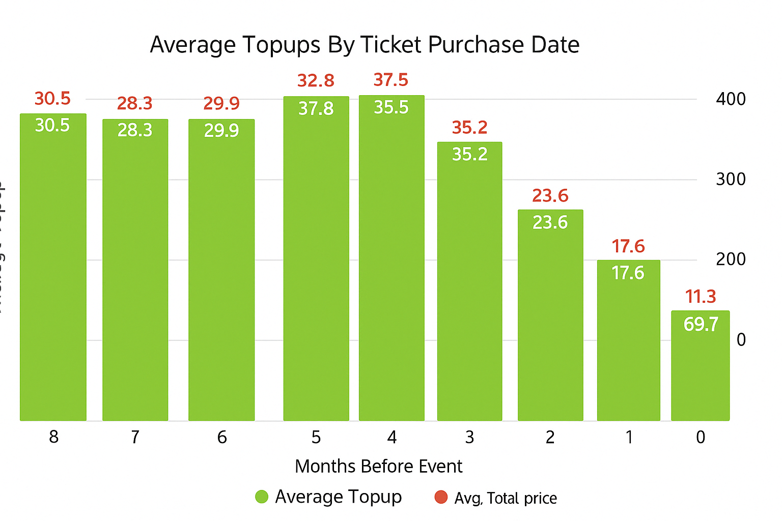
Average Toups By Ticket Purchase Date
This bar and dot combo chart plots average topup amount (bar) and average ticket price (dot) by months before the event the ticket was purchased.
How to use it:
- Identify if earlier purchasers spend more or less overall.
- Understand value patterns by buyer timeline.
- Tailor communication strategies for early vs. late buyers.
Total Customer Value Insight
This AI-generated narrative provides instant context based on the visualisations that follow, in this case the Total Customer Value by Ticket Category data.
- This offers a natural language summary of key trends.
- It eliminates the need for manual interpretation of graphs.
The purpose is to clearly communicate how ticket category contributes to customer value.
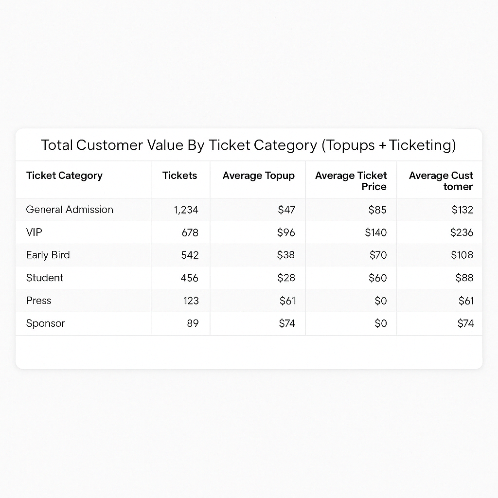
Total Customer Value By Ticket Category (Topups + Ticketing)
This tile presents a side-by-side view of topup behavior and ticket value, aggregated by ticket category. It includes the number of tickets, average topup, average ticket price, and the combined average customer value.
How to use it:
- Identify which ticket categories drive the highest customer lifetime value.
- Compare topup behavior across standard and premium categories.
- Use for pricing analysis and promotional targeting.
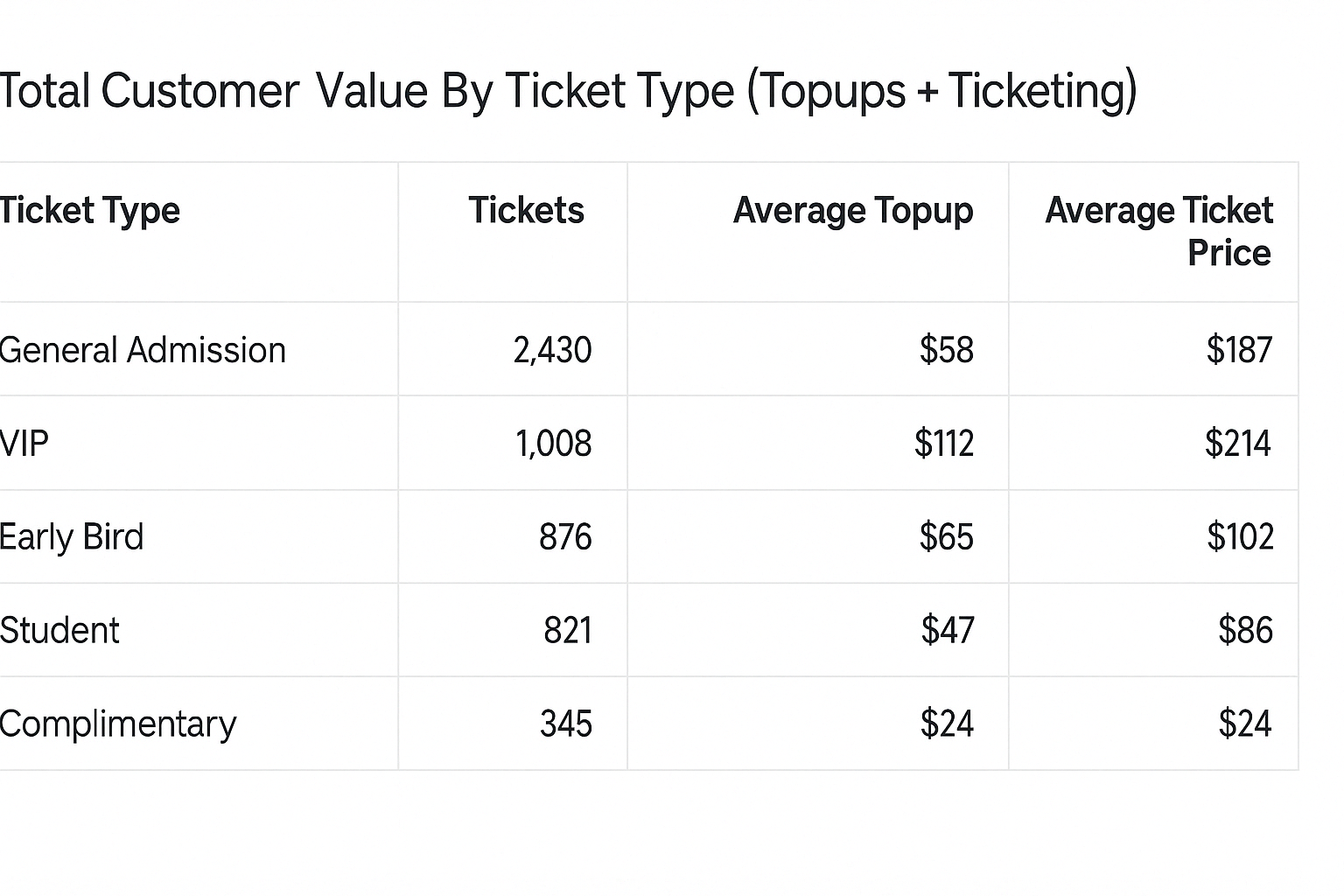
Total Customer Value By Ticket Type (Topups + Ticketing)
This granular view drills down one level deeper, splitting the data by individual ticket types (e.g. Early Bird, Phase 2) within each category. It calculates the average spend per customer, including both topups and ticket price.
How to use it:
- Understand performance of individual ticket types.
- Identify which ticket types attract higher-spending attendees.
- Refine release strategies and offers based on value per type.
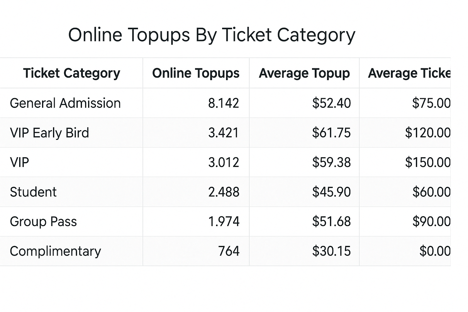
Online Topups By Ticket Category
This bar chart reports on online topups only, segmented by ticket category. It includes the total value of online topups, the number of transactions (count), and the average topup per customer.
How to use it:
- Evaluate online engagement and pre-event cashless adoption.
- Determine which customer segments are most likely to topup in advance.
- Plan topup incentives or early-bird promotions.
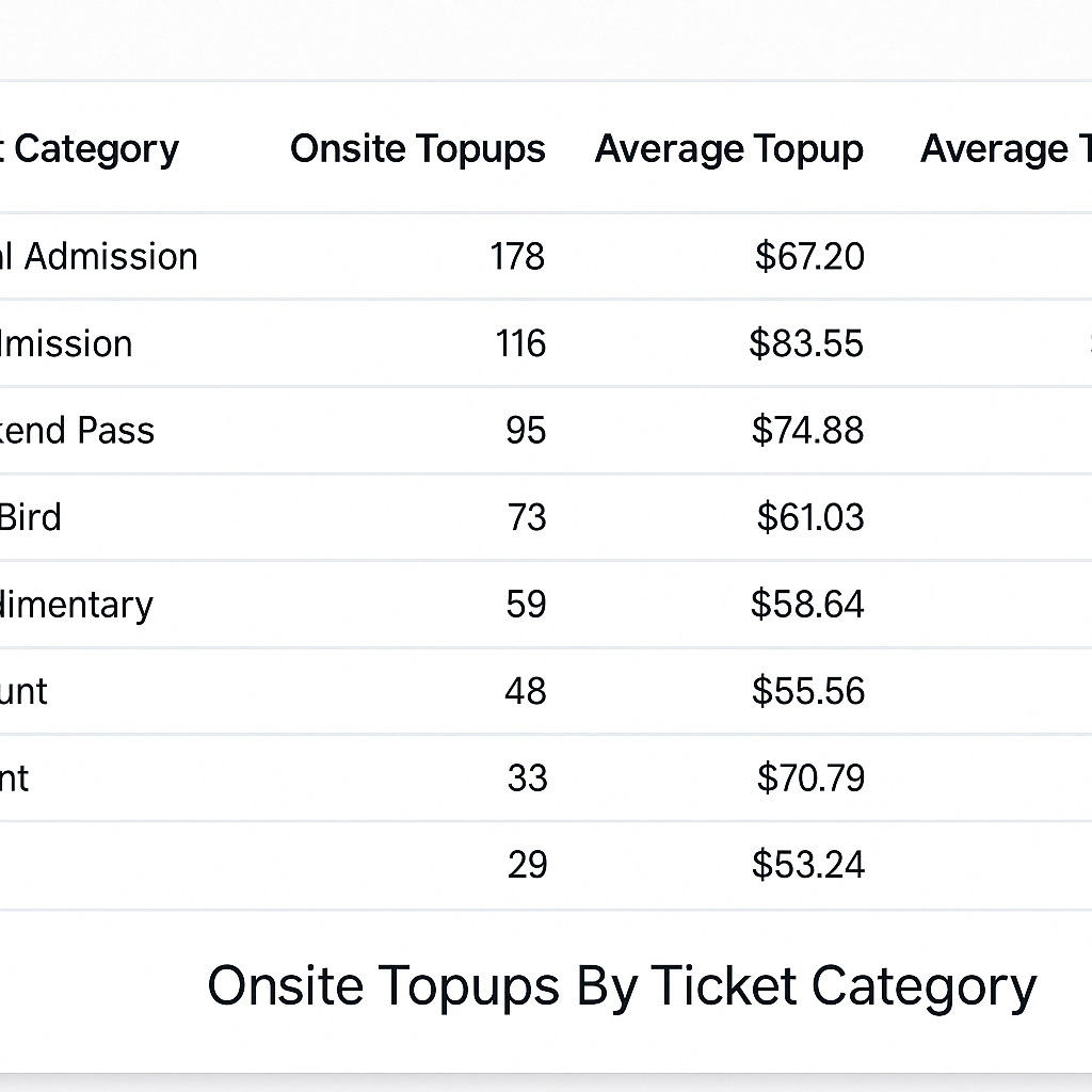
Onsite Topups By Ticket Category
This pie chart (or table, depending on the version) shows the distribution of onsite topup amounts across all ticket categories.
- Each slice or row represents a ticket category’s share (%) of total onsite topup value.
- Allows organisers to see which ticket types relied most on in-person topups at the event, and which didn’t.
- Helps determine:
- Whether certain groups need more education about online topups.
- Which categories may require more on-site support (e.g., customer service or signage).
- The load placed on topup stations by different attendee segments.
- Can inform improvements to future pre-event comms and station layouts to encourage smoother topup flows.