Dashboard Guide 6.3.5. Total Topup Demographic
 Updated
by Robyn Marais
Updated
by Robyn Marais
This dashboard explores how cashless topup activity varies across demographic groups, including location, gender, and age. It enables organisers to better understand who is topping up, where they're from, how much they topup, and how these patterns differ by channel (online vs onsite).
This guide walks through each tile to help you interpret the data and use the insights to support event planning, marketing, and infrastructure decisions.
This guide walks you through each key element of the dashboard to explain what the visuals represent and how to interpret the data effectively.
The dashboard enables you to:
- Identify geographic regions (countries/cities) driving the most cashless spend
- Compare demographic segments in terms of topup volume and value
- Tailor communication strategies to high- or low-spending groups
- Optimize on-site infrastructure and staffing based on topup patterns
- Build a stronger profile of your attendees by understanding how different age groups and genders interact with the cashless system
Key Metrics
Total Topups: Total value of all online and onsite top-up transactions combined.
Total Topups (Qty): Total number of top-up transactions completed.
Count of Users With an Online Topup: Number of unique users who completed at least one online top-up.
Avg Online Topup Value of Those Who have Topped-up: Average online top-up amount per user among users who made an online top-up.
Count of Users With an Onsite Topup: Number of unique users who completed at least one onsite top-up.
Average Onsite Topup For those That Topped-up: Average onsite top-up amount per user among users who made an onsite top-up.
Average Online Topup: Average value per online top-up transaction.
Average Onsite Topup: Average value per onsite top-up transaction.
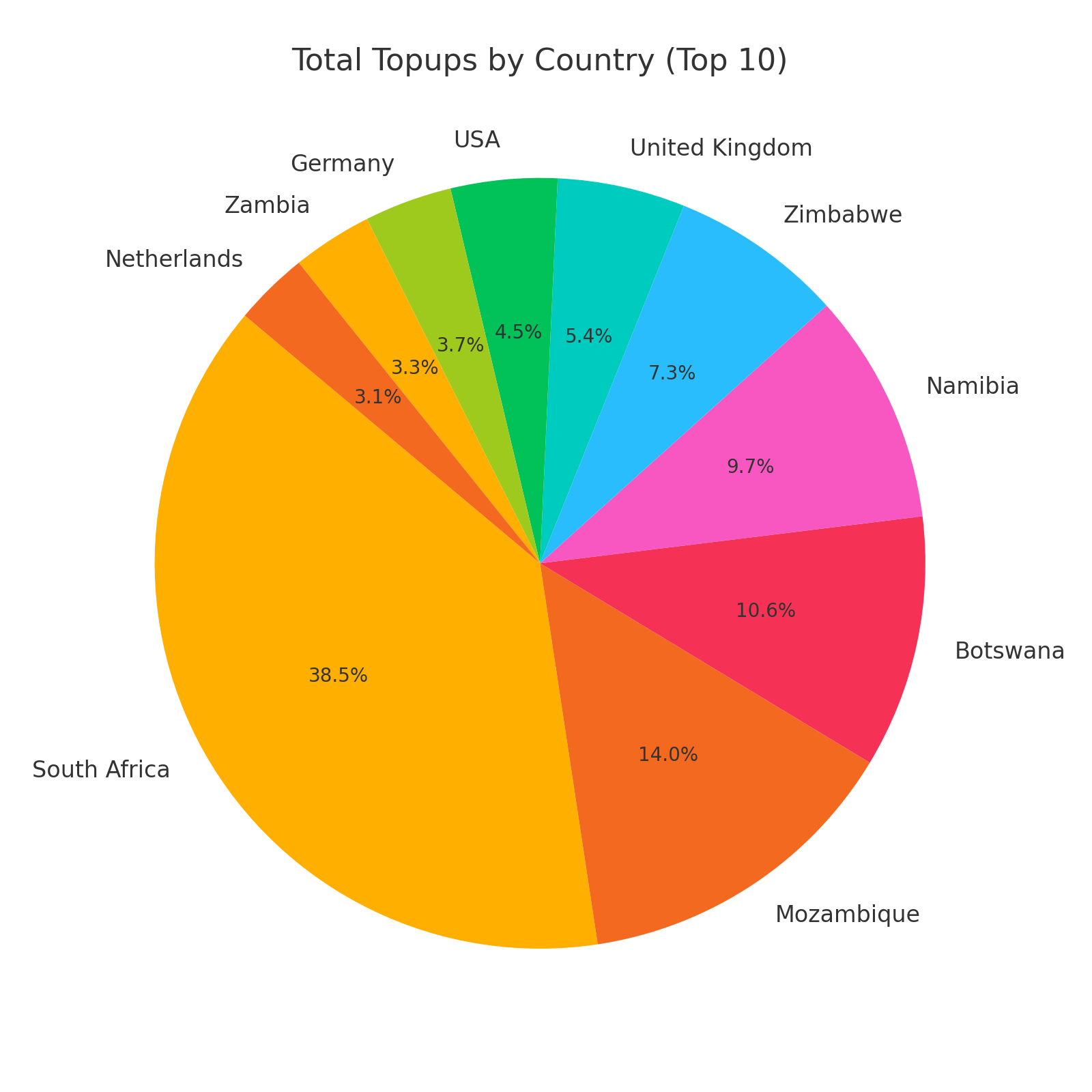
Total Topups by Country (Top 10)
A pie chart showing the % contribution of topups by top 10 country.
How to use it:
- Identify which countries your spenders are coming from.
- Understand international market potential for future targeting.
- Monitor geographic split between local and international attendees.
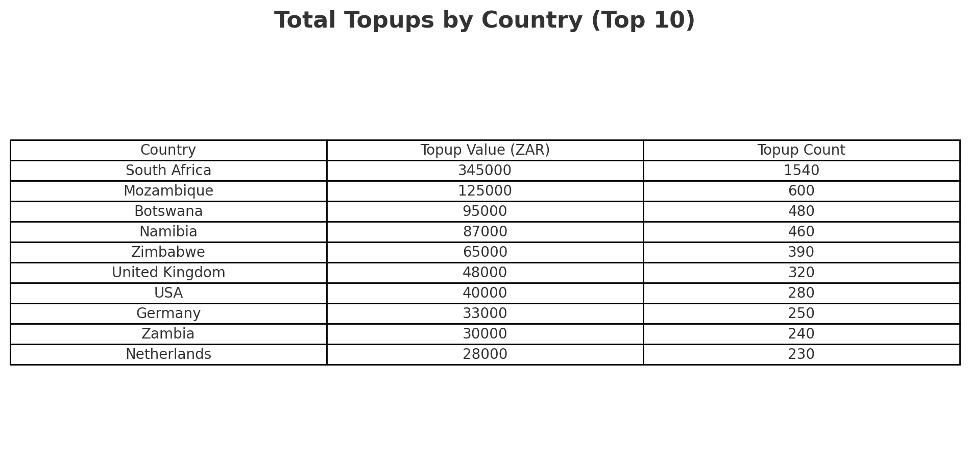
Total Topups by Country
A table showing the total value, volume and % contribution of topups by country.
How to use it:
- Identify which countries your spenders are coming from.
- Understand international market potential for future targeting.
- Monitor geographic split between local and international attendees.
Total Topups Top 10 Cities
Similar to the above, but zoomed into top-performing cities by total topup 5 contribution.
How to use it:
- See which local areas contribute most to event spend.
- Inform localised marketing, partnerships, or merchandise placement.
- Refine sponsor targeting by region.
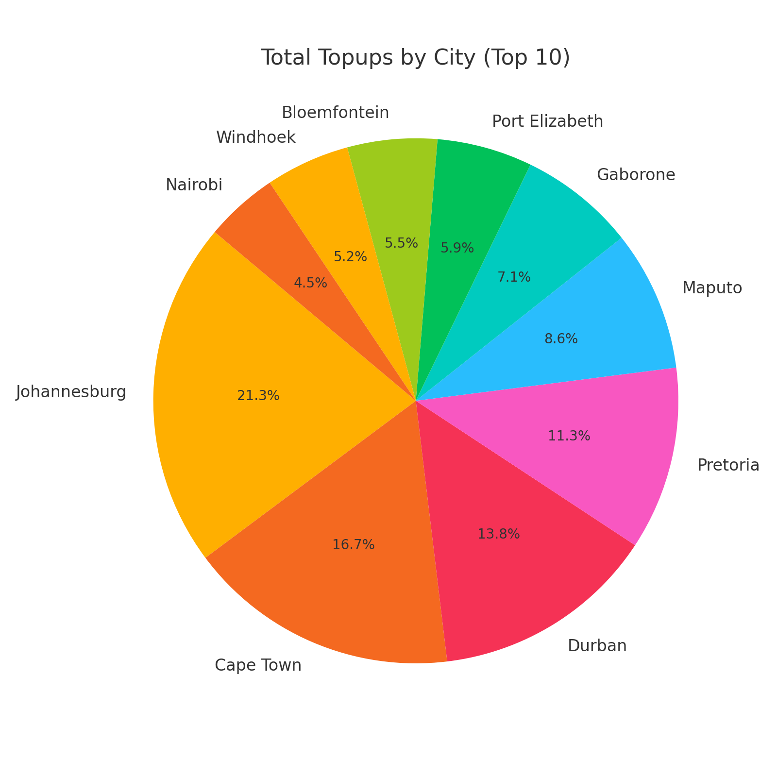
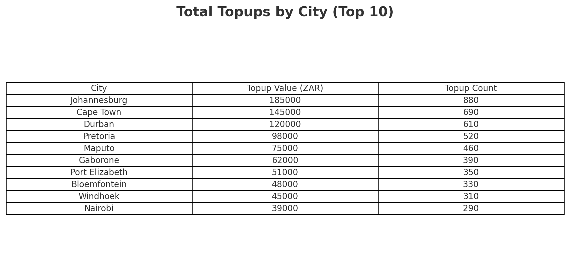
Total Topups by City
Similar to the above, but zoomed into top-performing cities by total topup value, quantity and % contribution.
How to use it:
- See which local areas contribute most to event spend.
- Inform localised marketing, partnerships, or merchandise placement.
- Refine sponsor targeting by region.
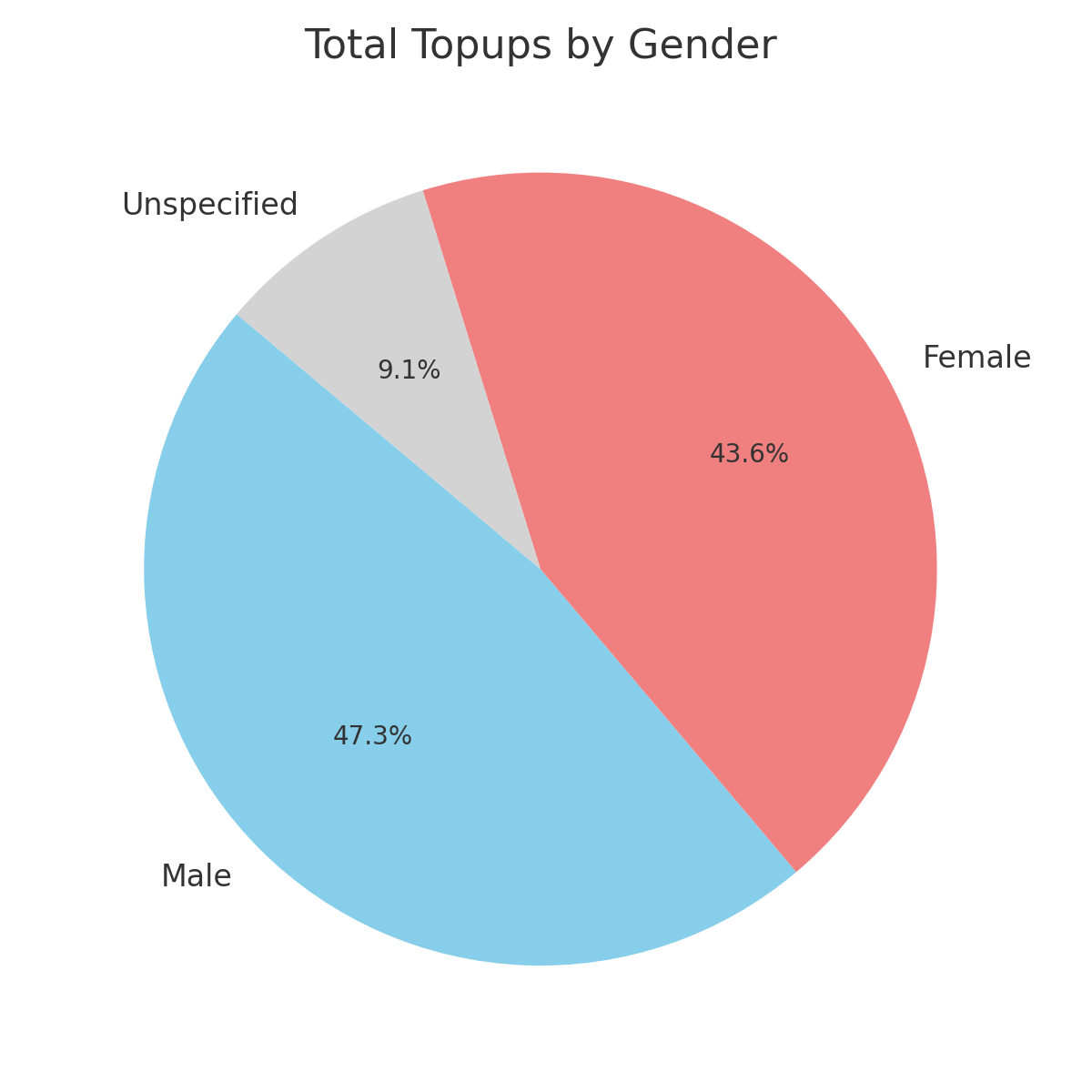
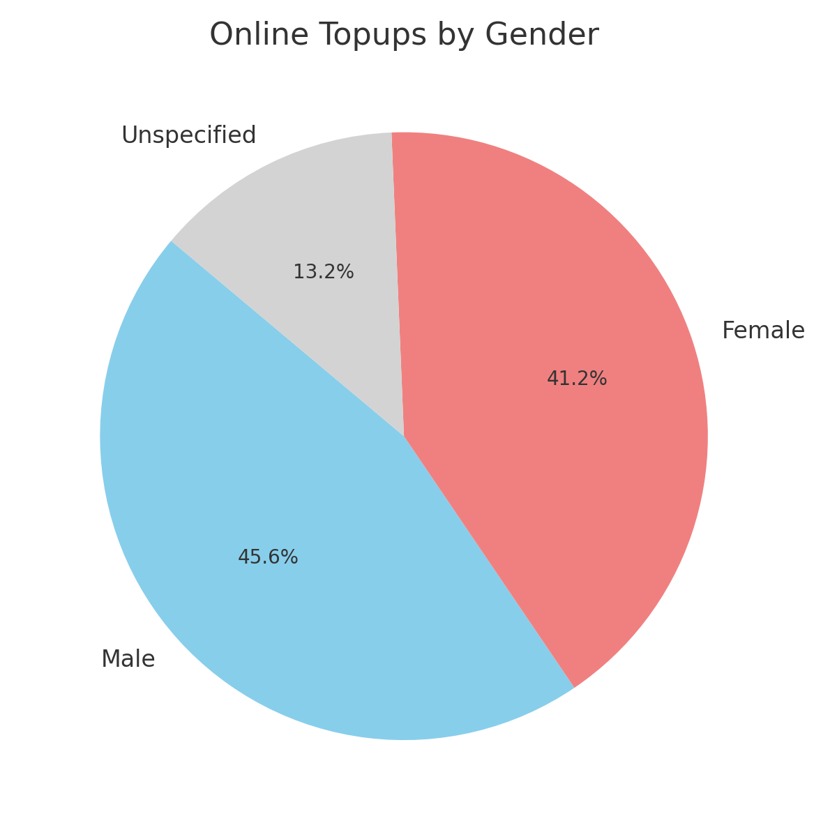
Total Topups by Gender
A pie or bar chart showing gender distribution of topup activity (e.g. % male, female, unspecified).
How to use it:
- Understand gender split of spenders.
- Support gender-sensitive marketing or design decisions.
- Cross-check balance across ticket types or access tiers.
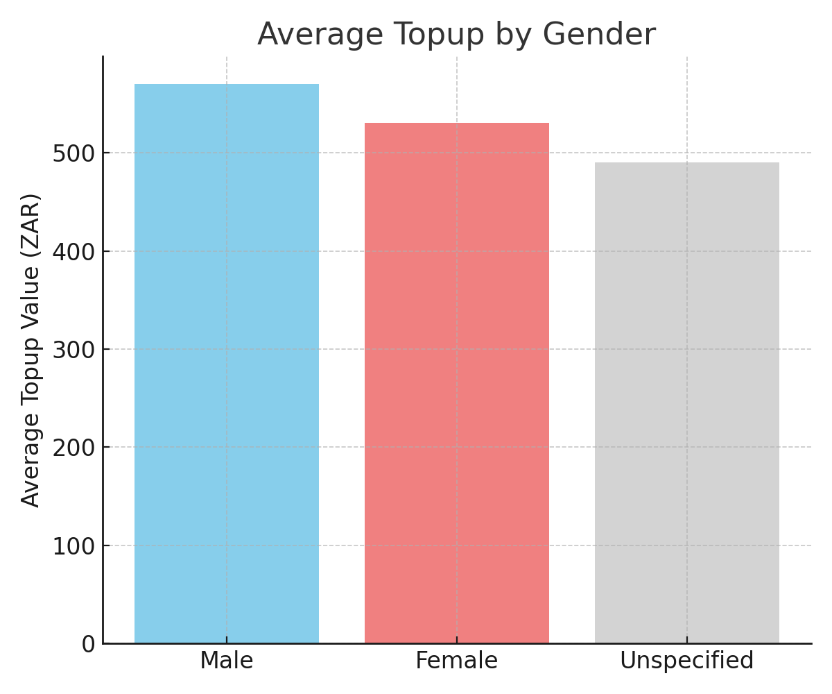
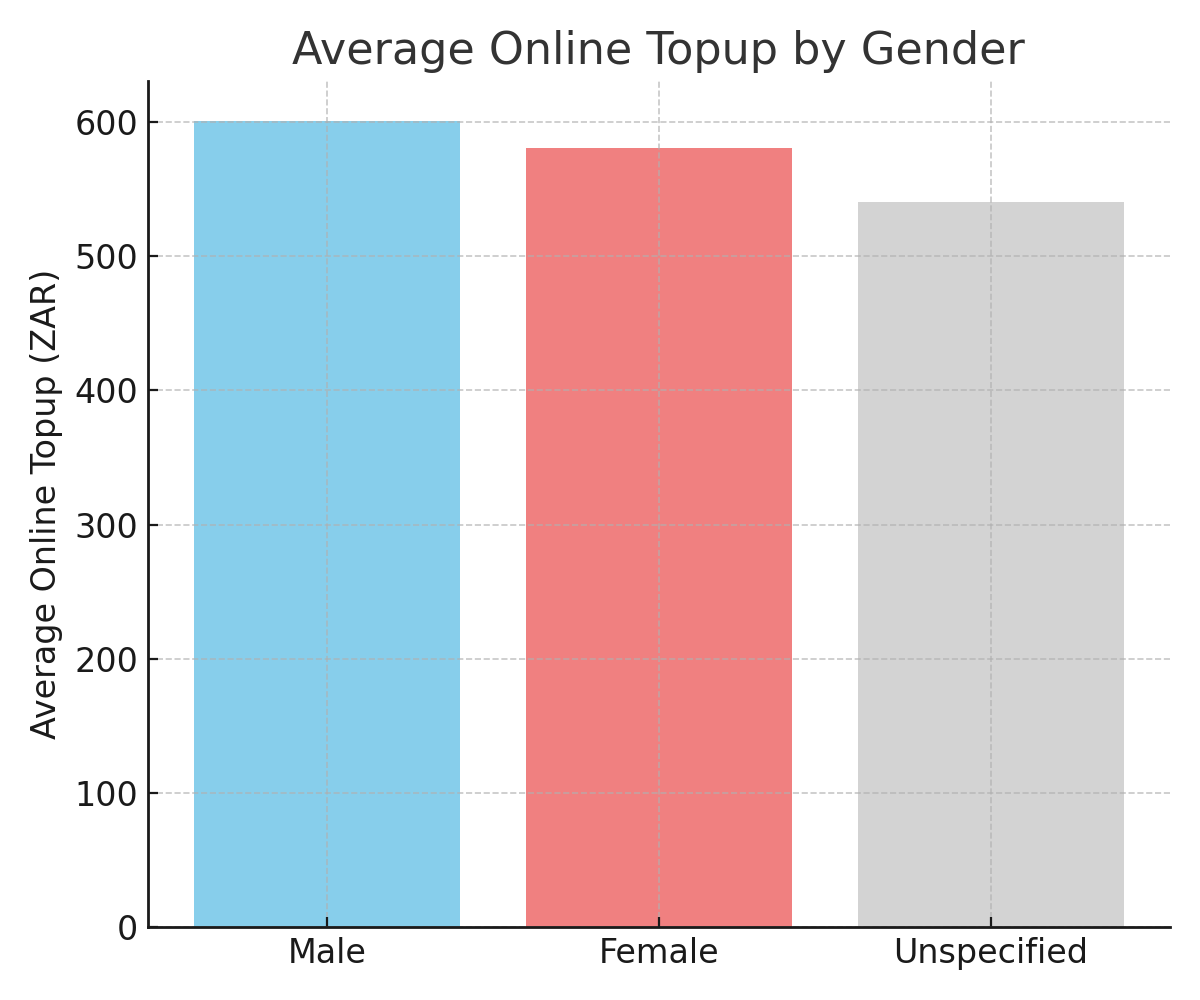
Average Topup by Gender
Displays average topup value per person within each gender category.
How to use it:
- Identify which gender group is topping up more on average.
- Adjust spend-based rewards or loyalty programs accordingly.
- Reveal engagement differences between demographic groups.
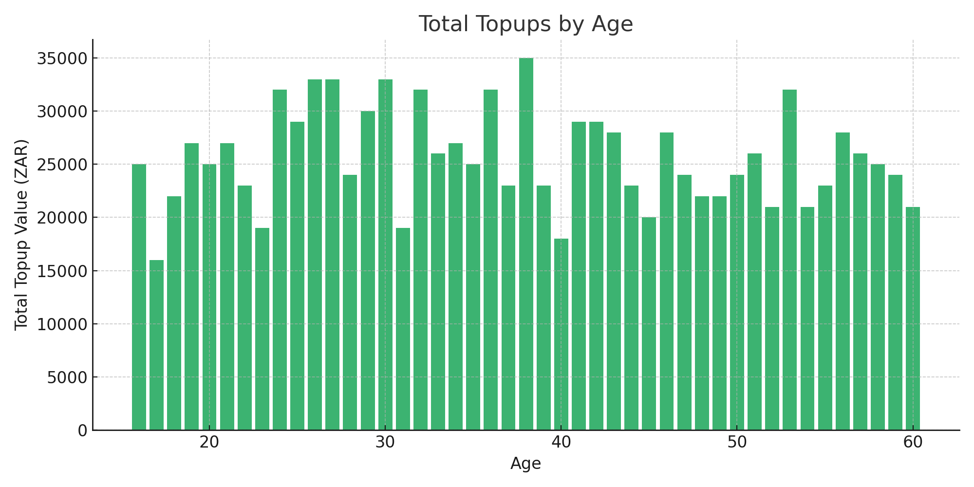
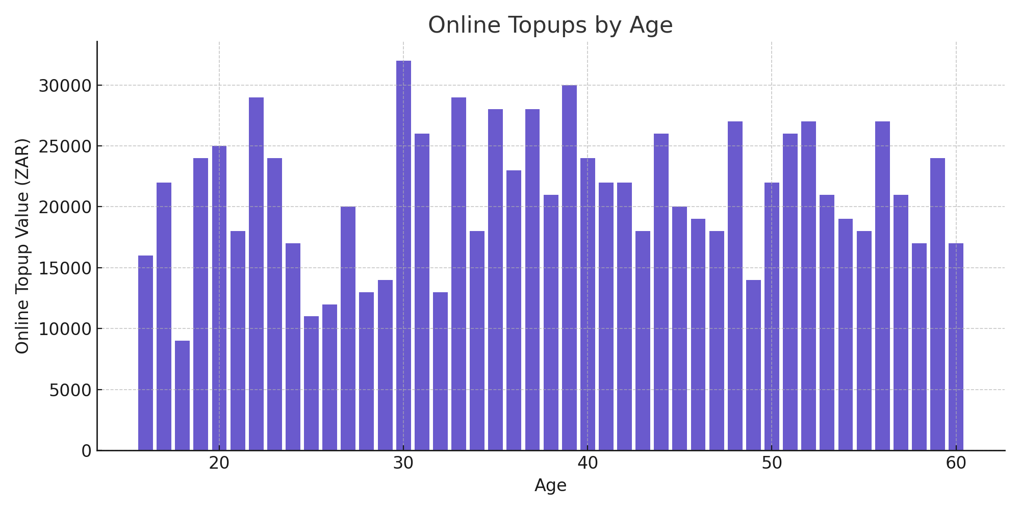
Total Topups by Age
A histogram mapping topup value by age group.
How to use it:
- Pinpoint the age groups driving the highest cashless spend.
- Tailor age-specific incentives, communications, or ticket bundles.
- Inform partnerships with brands or products relevant to specific age brackets.
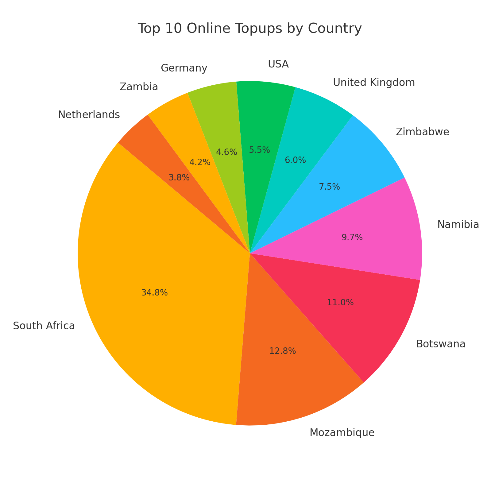
Top 10 Online Topups by Country
A pie chart of online topup activity by country as a % contribution per top 10 countries.
How to use it:
- Determine which markets are adopting the online topup feature.
- Measure digital engagement and trust in the platform.
- Prioritise comms in underperforming geos.
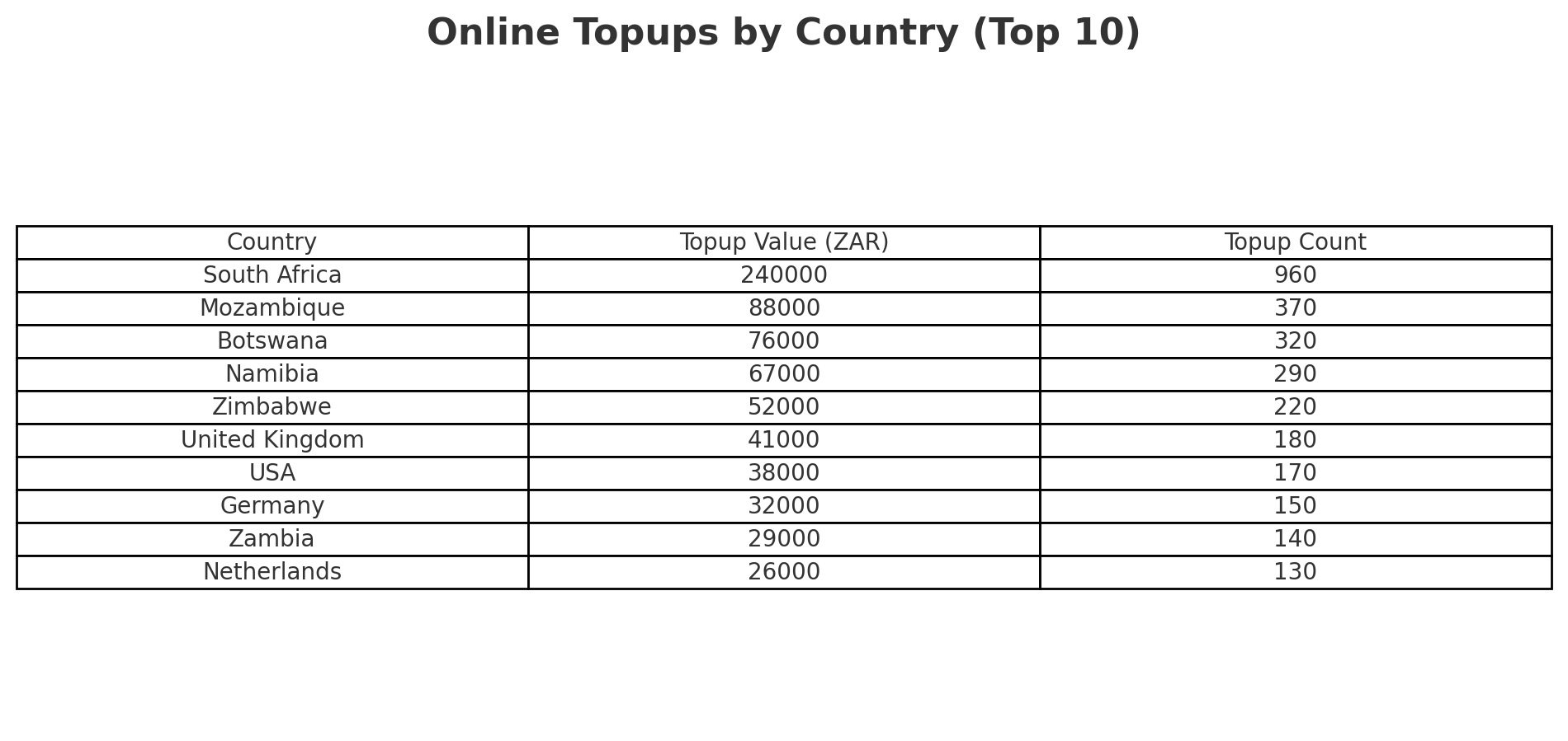
Online Topups by Country
A breakdown of online topup activity by country (value, quantity, and percentage of total online topups).
How to use it:
- Determine which markets are adopting the online topup feature.
- Measure digital engagement and trust in the platform.
- Prioritise comms in underperforming geos.
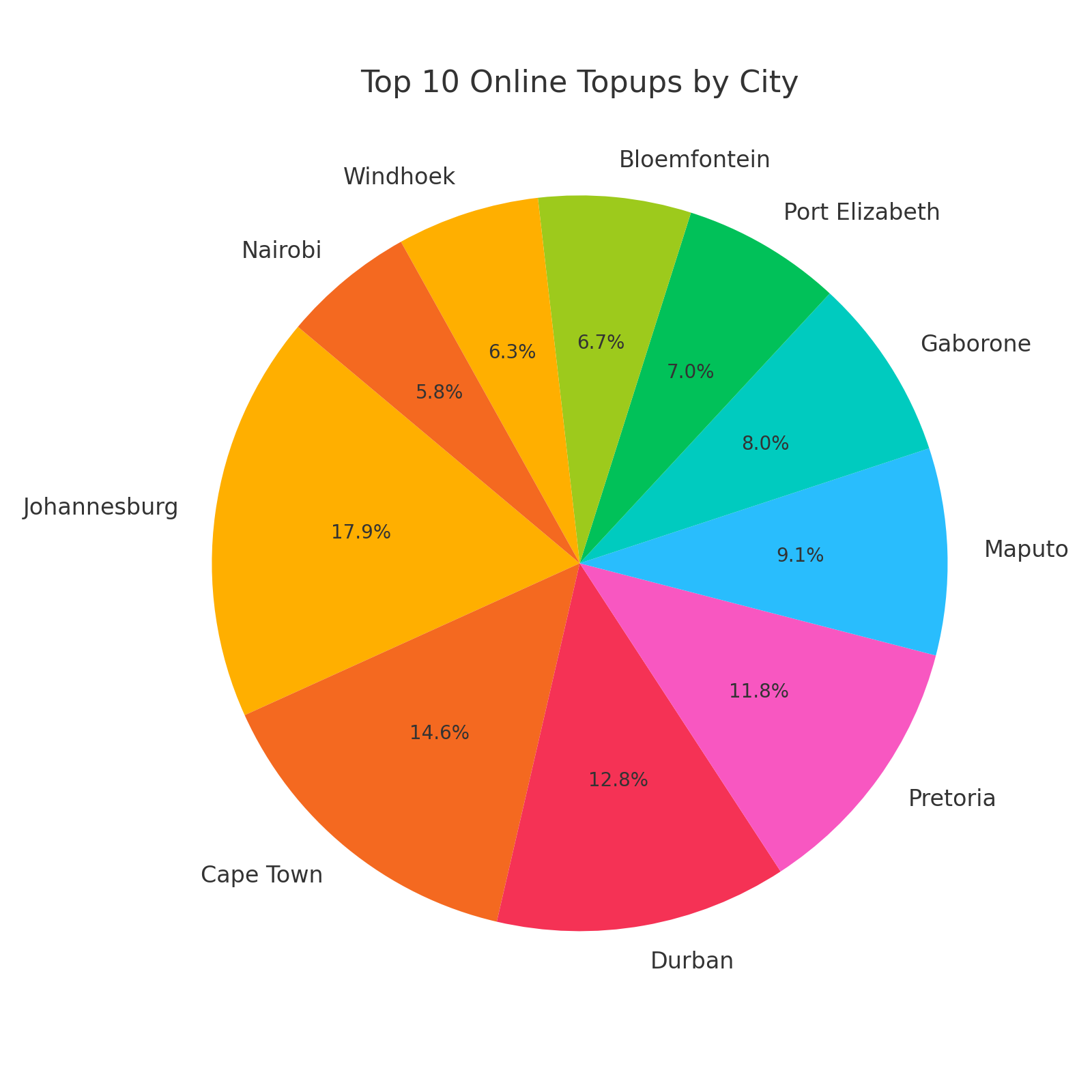
Top 10 Online Topups by City
Similar to the above but city-focused. Displays a % contribution per top 10 cities.
How to use it:
- Measure regional interest in digital ticketing and payments.
- Align campaign timing and messaging to those more inclined to topup online.
- Highlight which cities might require more education on pre-loading.
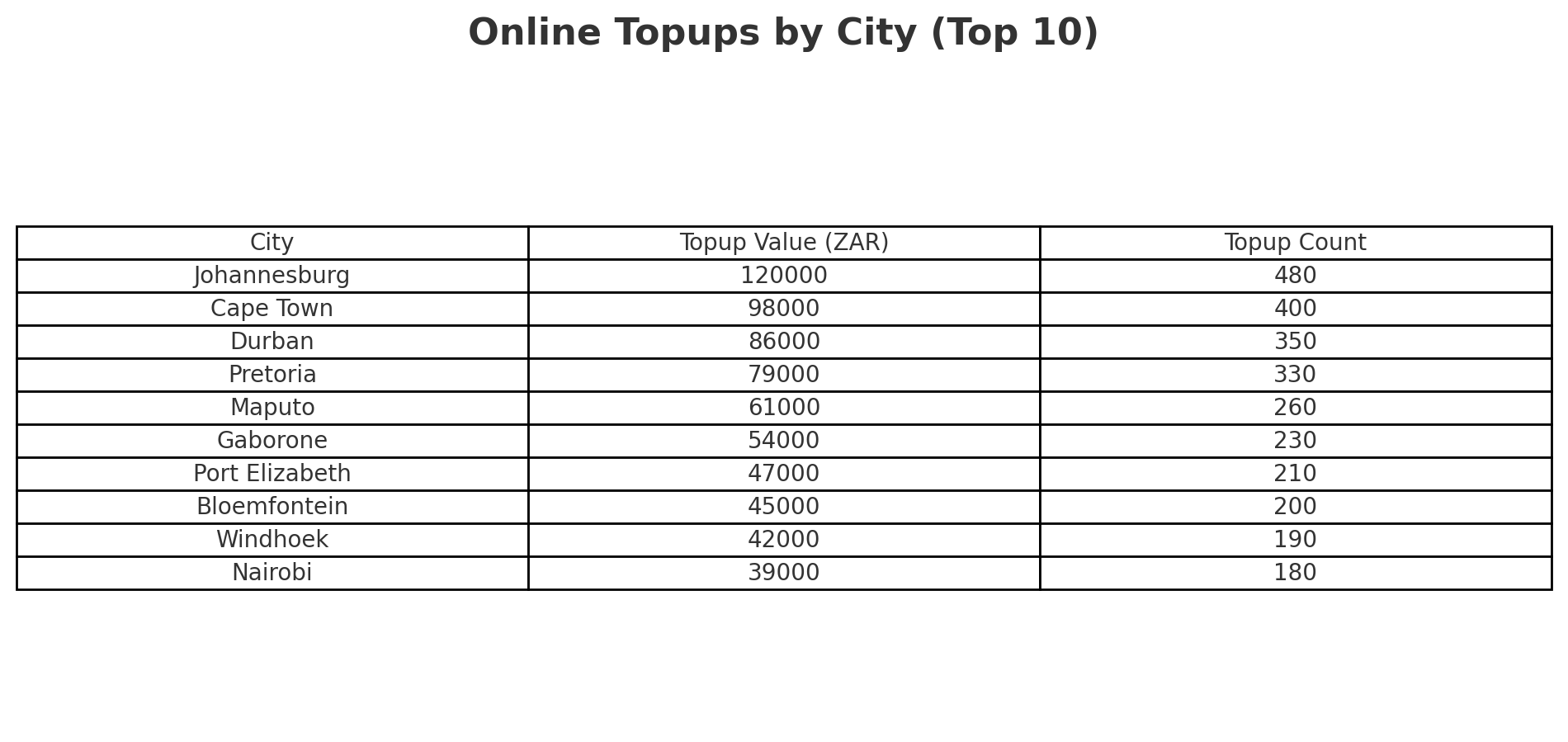
Online Topups by City
Similar to the above but city-focused. Displays top cities by online topup value and frequency.
How to use it:
- Measure regional interest in digital ticketing and payments.
- Align campaign timing and messaging to those more inclined to topup online.
- Highlight which cities might require more education on pre-loading.
Online Topups by Gender
Displays the gender breakdown of online topup users.
How to use it:
- Compare this to onsite gender data to assess differences in channel usage.
- Highlight gendered user behavior for online vs in-person platforms.
Average Online Topup by Gender
Shows how much each gender spends, on average, when topping up online.
How to use it:
- Gauge differences in digital spending habits.
- Adjust online-exclusive offers based on high-value segments.
Online Topups by Age
Shows how much each gender spends, on average, when topping up online.
How to use it:
- Gauge differences in digital spending habits.
- Adjust online-exclusive offers based on high-value segments.
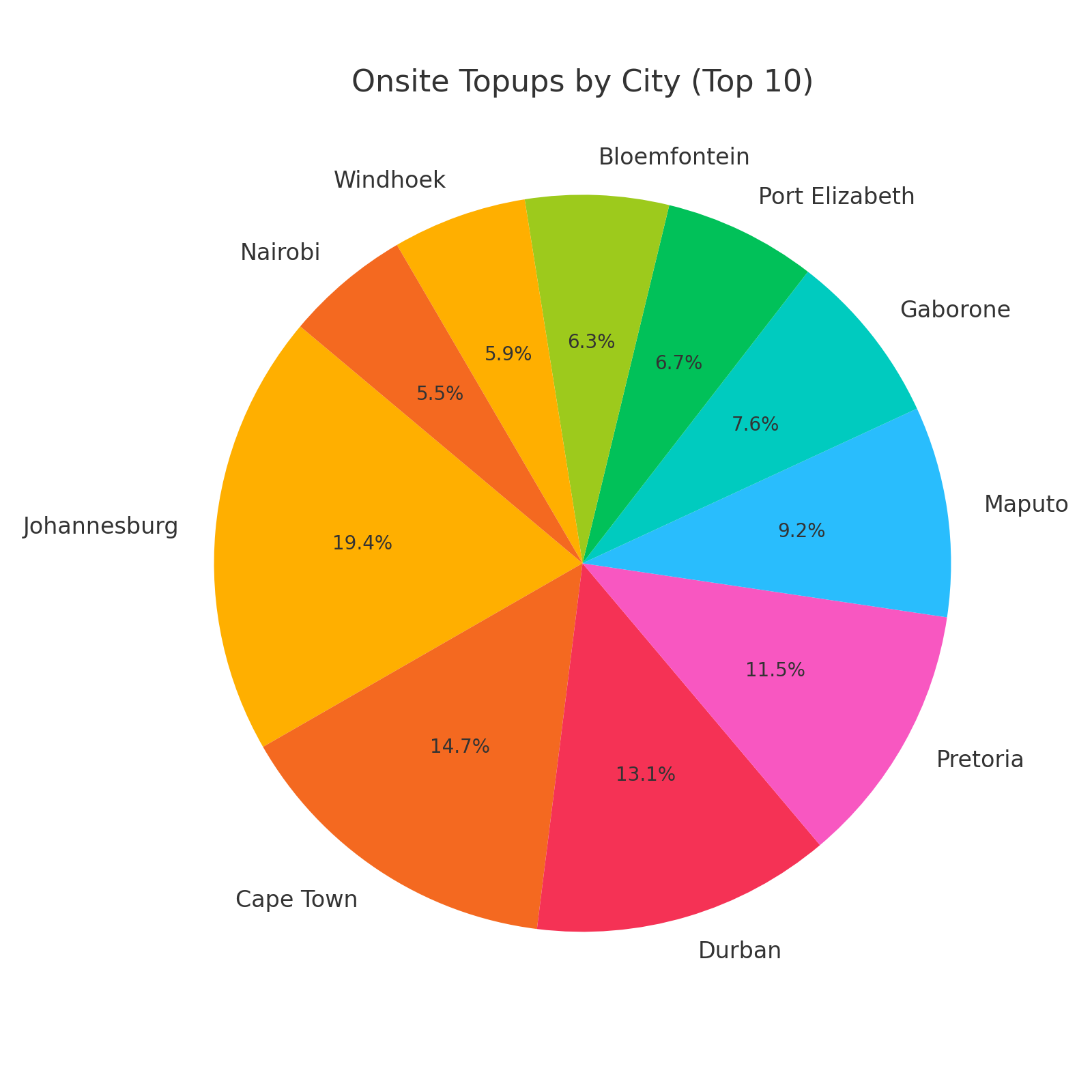
Onsite Topups by City
This highlights which cities your onsite topup users are from.
How to use it:
- Plan for regional differences in how users engage with the cashless system.
- If certain cities rely more on onsite, adjust infrastructure accordingly.
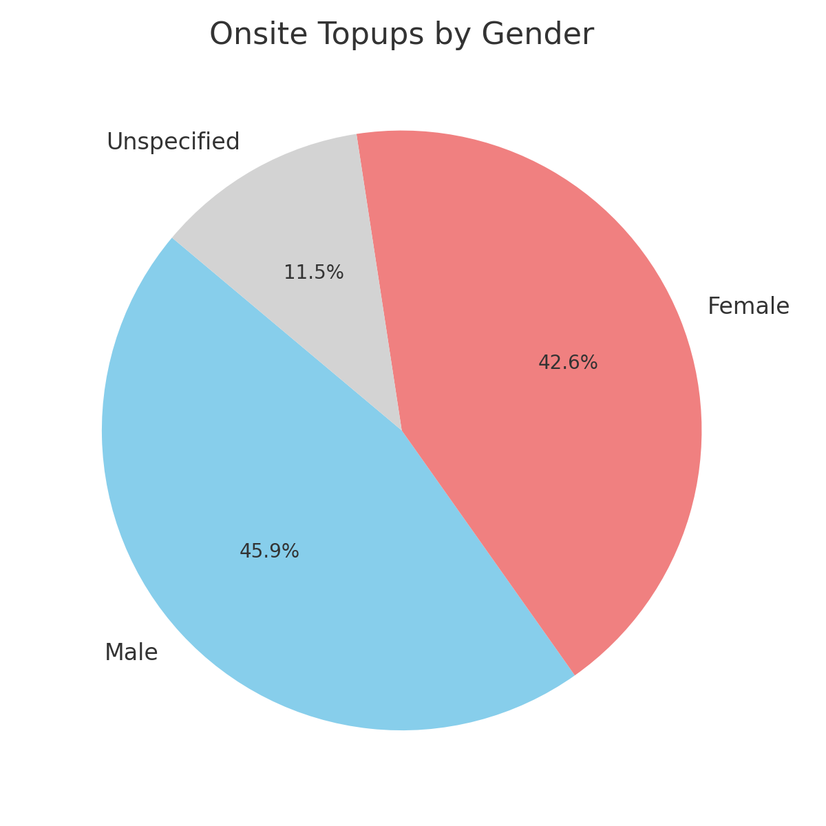
Onsite Topups by Gender
Compares onsite usage across gender, providing a picture of in-event user behavior.
How to use it:
- Understand if men or women are more likely to topup onsite.
- Identify gender-specific behavior that can inform service design.
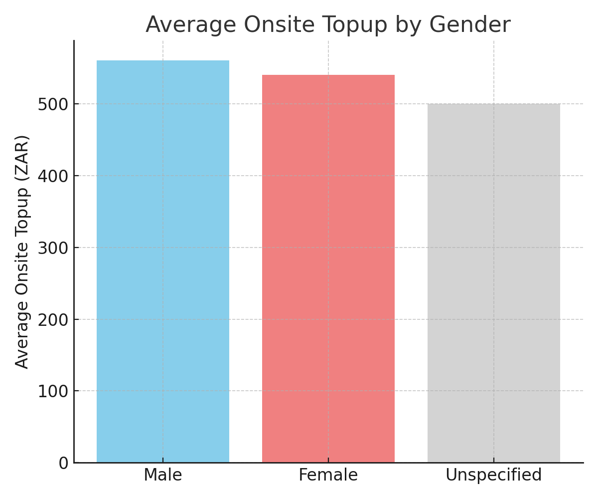
Average Onsite Topup by Gender
Averages onsite spending per person, segmented by gender.
How to use it:
- Fine-tune pricing strategies.
- Offer tailored packages based on predicted spend levels.
Onsite Topups by Age
Total and average onsite topup values by attendee age group.
How to use it:
- Learn which ages engage most with onsite services.
- Align signage, promotions, or station locations based on this data.

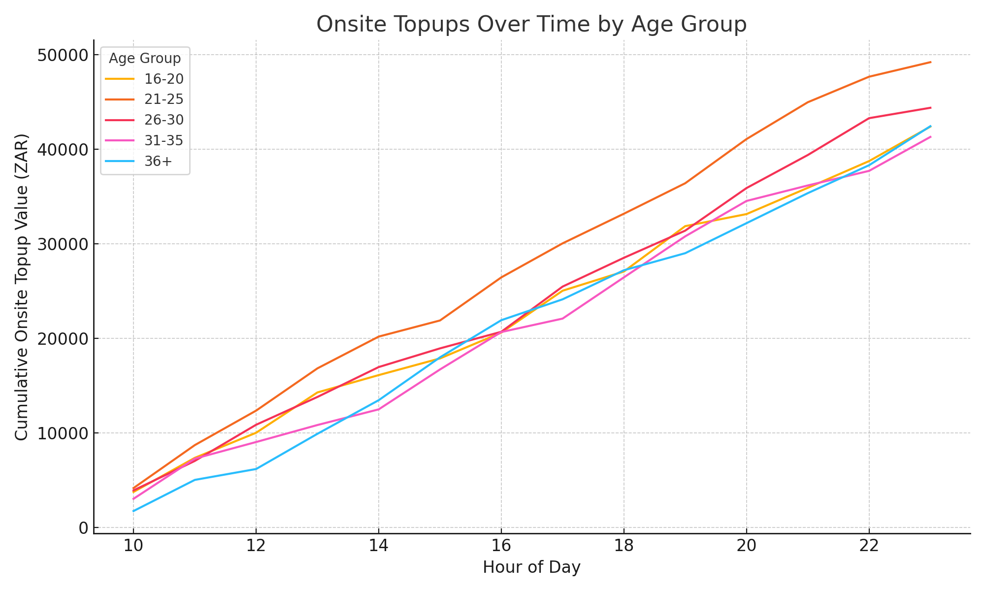
Onsite Topups Over Time by Age
A time series showing onsite topup value by age group across each day/hour of the event.
How to use it:
- Spot hourly demand patterns across different demographics.
- Inform live staffing, queue management, and operational pacing.
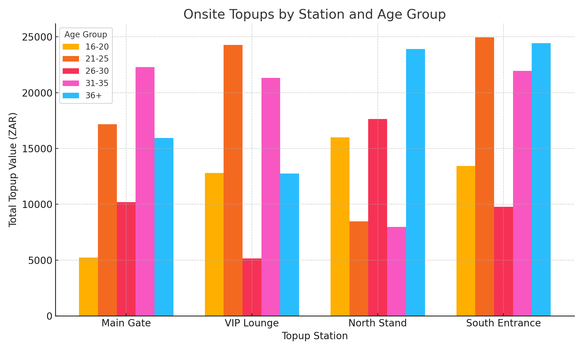
Onsite Topups by Station
Visualizes total onsite topup value by age across physical station locations.
How to use it:
- Determine which stations are most/least utilized by different age groups.
- Optimise resource placement for future events.
- Detect technical or positioning issues if a station underperform