Attending An Event
Account Settings
Billing and Payment
Account Settings
Delete Your Account
Link Facebook or Google
ID or Passport Number Not Valid
Edit Details on Your Profile
Privacy and Security
Tickets
Cashless
Howler Active
Organising An Event
Getting Started
Video Tutorial - Getting Started
Organiser Approval Process
Getting Started with Howler
Our Services
Getting Paid
Howler Customer Support
Payment Gateway Options - For organisers
Manage your account
Setup your event
How to create an event
How to Make My Event Searchable on Howler.co.za
Event Look and Feel
Ticket Type Settings
How to enable donations for your event
Express Checkin
Enable Ticket Resale for your Event
Marketing Tools
Ticket Reps
How to drive ticket sales
Ticket Bundles and Specials
Issue Complimentary Tickets
Custom Ticket Type Links
Marketing Tools - Sending an email campaign
Marketing Tools - Sending an SMS campaign
Setting Up Google Analytics Tracking
Integrating the Facebook Pixel
Howler Brand/CI/Style Guide
Embedded links
Create a QR code linking to your ticketing page
Sponsor Assigning Complimentary Tickets
Event Customisation
Event Page Customisation within the organiser portal
Premium Event Customisation
How to Optimize an Image
Going Cashless
Going Cashless with Howler
Howler RFID Wristband Design Template
Vendor fees - For organisers
Cashless Sales Reports
How to drive Online Topups for a Cashless event.
Cashless Customer Journey
Ticket Scanning
Reporting
Event Protect
Howler Backend - Active Admin
Howler Backend Active Admin
Howler Backend Active Admin - Manage Organiser Roles
Howler Backend Active Admin - Reps
Howler Backend Active Admin - GTM configuration
Howler Backend Active Admin - Create Ticket Types
Howler Backend Active Admin - Promo Codes
Howler Backend Active Admin - Create a Pre Registration Event
Howler Backend Active Admin - Unique Registration
Howler Backend Active Admin - Data Capture
Streaming Online Events
How to create an Online Streaming Event
How to enable Express Check-in for your event
Finding your stream URL
How to schedule a Facebook Live video stream - Using your computer
How to start a Facebook Live video stream - Using your mobile device
How to setup a private Zoom web conference
Pulse
Dashboard Guide 1.1. Ticketing Overview YoY Analysis
Dashboard Guide 1.2. Daily Sales Dashboard
Dashboard Guide 1.3. Ticket Type YoY Analysis
Dashboard Guide 1.4. Price YoY Analysis
Dashboard Guide 1.5. Payment YoY Analysis
Dashboard Guide 4. Audience YoY Analysis
Dashboard Guide 5. Abandoned Cart
Dashboard Guide 6.1.1. Event Sales Overview
Dashboard Guide 6.1.3. Bar Sales
Dashboard Guide 6.1.5. Event Sales Demographics
Dashboard Guide 6.3.1. Total Topups Overview YoY Analysis
Dashboard Guide 6.3.4. Total Topup Ticket Type YoY Analysis
Dashboard Guide 6.3.5. Total Topup Demographic
Dashboard Guide 6.1.4. Vendor Sales
Dashboard Guide 6.2. Cashless Check-Ins Dashboard
Dashboard Guide 6.1.6 Event Sales Ticket Type Analysis
Dashboard Guide 6.3.3. Onsite Topups YoY Analysis
Dashboard Guide 6.3.2. Online Topups YoY Analysis
Vendor at an event
Setting Up Your Vendor Account
Setting Up For An Event
Setting Up Your Menu
Editing Vendor Bank Details
How to use the Howler Cashless Point of Sales Devices - Training Video
Vendor Fees
Vendor Settlement
The Vendor Agreement
Vendor Sales Reports
Legal
Partners Resources
- All Categories
- Organising An Event
- Pulse
- Dashboard Guide 6.2. Cashless Check-Ins Dashboard
Dashboard Guide 6.2. Cashless Check-Ins Dashboard
 Updated
by Robyn Marais
Updated
by Robyn Marais
This dashboard provides a real-time and retrospective view of how attendees entered the event via ticket scanning. It tracks total check-ins, ticket types, categories, and station-level performance to support live operations, queue management, and post-event reporting.
This guide walks you through each key element of the dashboard to explain what the visuals represent and how to interpret the data effectively.
The dashboard enables you to:
- Monitor real-time entry and traffic flow across all check-in stations.
- Track check-in success rates vs. washouts (missed or invalid scans).
- Understand crowd arrival patterns for staffing and gate management.
- Analyse performance across ticket types and access categories.
- Optimise future entry logistics based on live and historic data.
Key Metrics
- Total Check-Ins: Number of attendees successfully scanned in.
- Check-In %: Percentage of valid tickets that were used at the gate.
- Washouts: Unused or invalid tickets (e.g. duplicates, no-shows).
- Washout %: Portion of ticket holders who did not attend or were rejected.
How to use it:
- Measure attendance vs. tickets sold.
- Understand no-show rates or scanning issues.
- Benchmark against historical event performance.
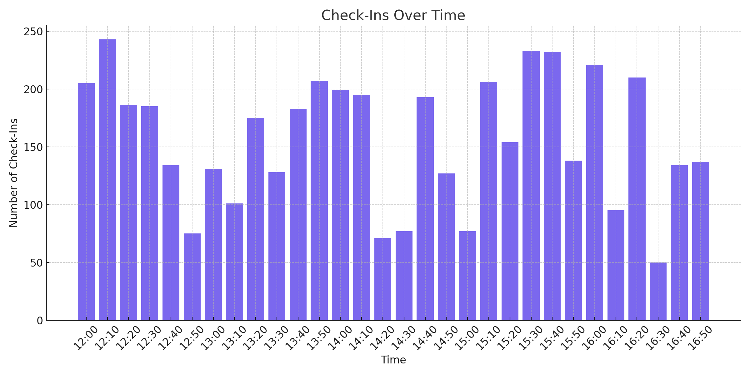
Check-Ins Over Time
What it shows: A bar graph plotting the number of check-ins at 10-minute intervals throughout the event duration.
Use the Check-In Time Groups Filter to edit the time interval used on this graph.
How to use it:
- Identify entry rush periods (e.g., opening gates, peak times).
- Manage gate staff shifts and security presence.
- Improve entrance layout or timing for future events.
Check-Ins per 10 Minutes by Station
What it shows: A stacked area line graph of check-ins across multiple scanning stations.
How to use it:
- Evaluate station throughput and load distribution.
- Pinpoint bottlenecks or high-performing access points.
- Inform layout changes for future events.
Check-Ins by Station
What it shows: A horizontal bar chart showing the total check-ins completed at each gate or station (e.g. GA, VIP, VVIP).
How to use it:
- Measure gate performance.
- Spot underutilised or overloaded scanning areas.
- Adjust signage or attendee routing.
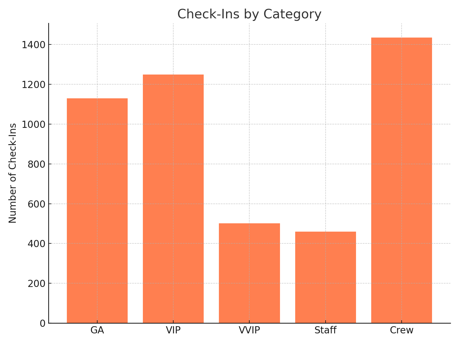
Check-Ins by Category
What it shows: A bar chart that breaks down check-ins by ticket category, such as General Admission (GA), VIP, VVIP, etc.
How to use it:
- Understand crowd composition and access zone volumes.
- Inform stock, staff, and bar/vendor placement by area.
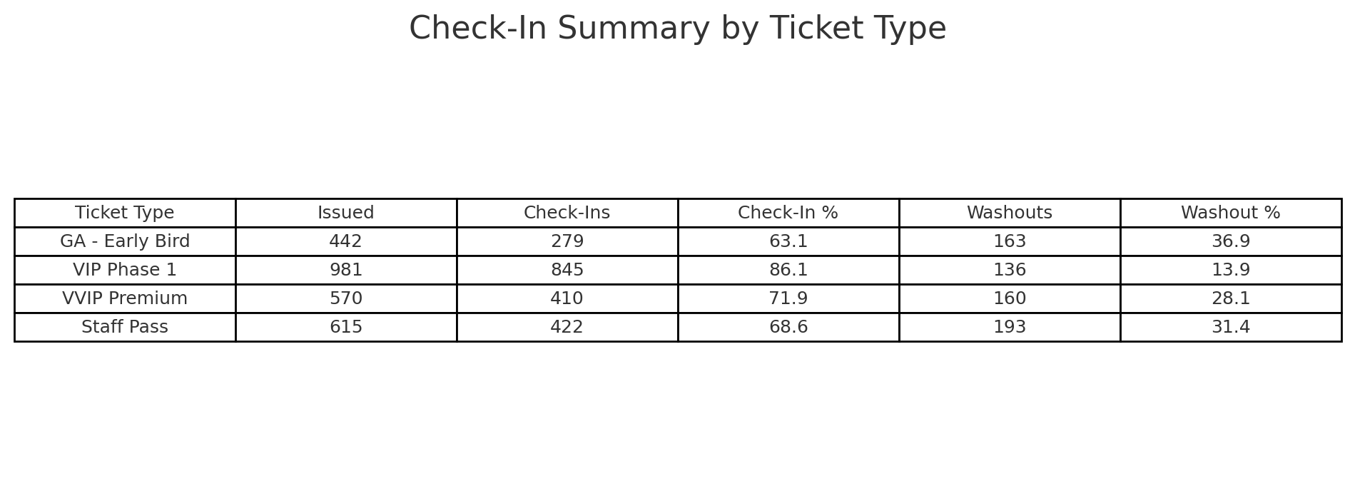
Check-Ins by Ticket Type Detail
What it shows: A detailed table showing:
- Ticket Type
- Quantity Issued (Cashless Tickets)
- Number Checked-In
- Check-In %
- Washouts and Washout %
How to use it:
- Audit usage of each ticket type (tiers, promos, complimentary).
- Spot high drop-off rates or scanning anomalies.
- Support reconciliation and reporting post-event.
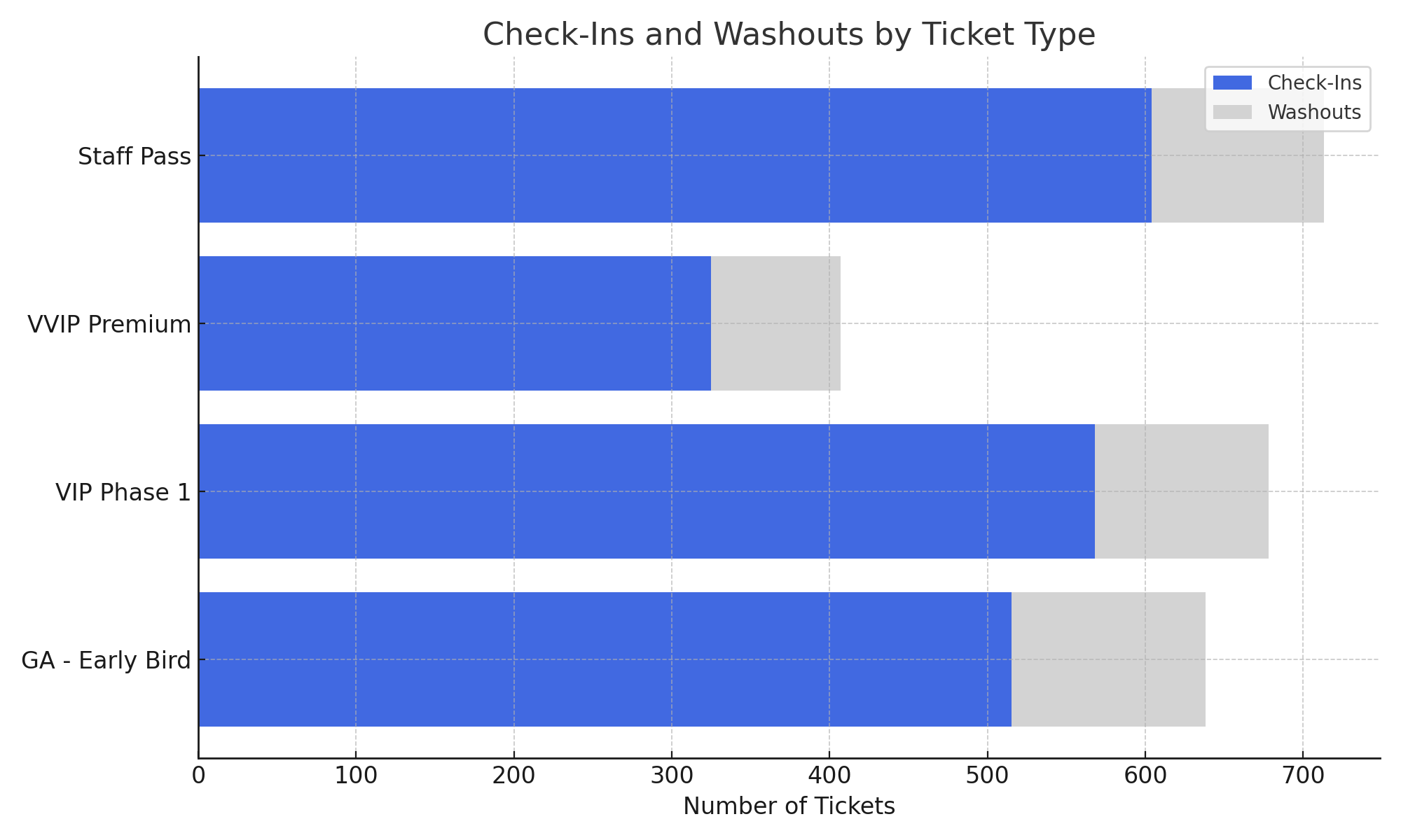
Check-Ins by Ticket Type
What it shows: A bar chart illustrating the number of check-ins by each ticket type with a comparison to washout volume.
How to use it:
- Visually compare high-performing and underutilised ticket types.
- Quickly assess engagement by audience segment.
- Evaluate promotional or complimentary ticket ROI.